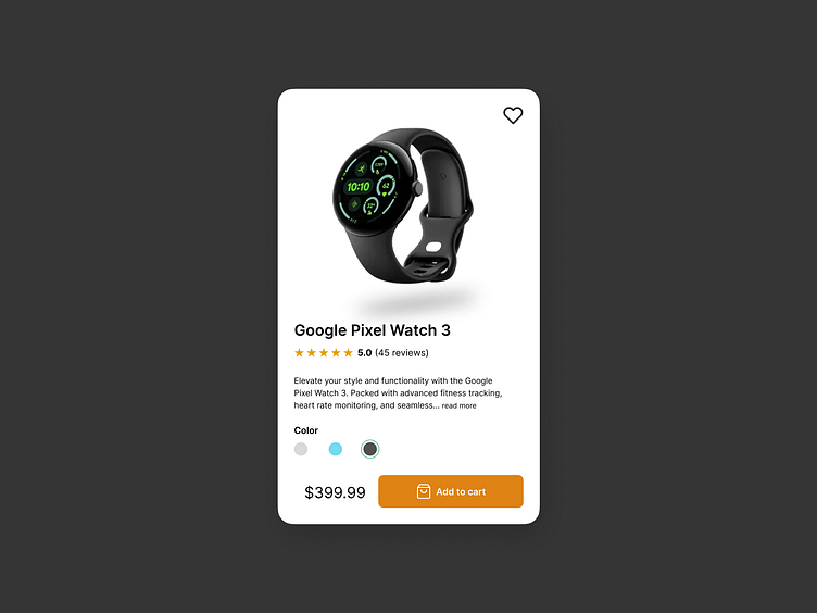
Day 1/90 – UI Design Challenge: Product Card for a Tech Wearable
Kicking off a 90-day UI design journey with a product card for the Google Pixel Watch 3! ⌚
In this design, I aimed for a clean and functional layout, integrating crisp CTAs and spotlighting the product's standout features. My focus was on ensuring a smooth user experience that's both aesthetically pleasing and practical.
What are your thoughts on the color scheme and layout? I'm open to suggestions and feedback! 🎨
This challenge is part of the UI design series by Michal Malewicz
#UIDesign #DailyDesignChallenge #TechProducts #UXDesign #MinimalistDesign #GooglePixelWatch #figma
More by Ashraful Anwar View profile
Like
