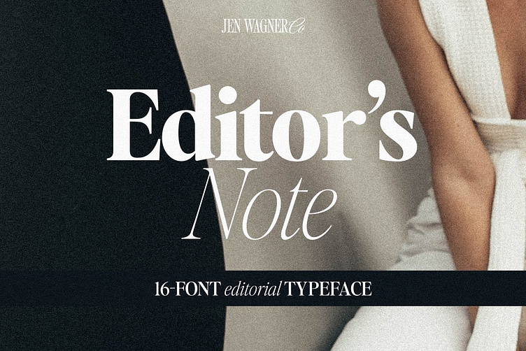
Editor's Note 16Font Editorial Serif
Say hello to the Editor's Note FAMILY – an expansion on Editor's Note that includes 16 fonts, regular and italic, from Hairline weight to Bold, and still has all the clean lines, tight curves, and trendy minimalist vibes!
I've been loving the clean, editorial type trend happening in design right now (let's be real, there's always a place for timeless editorial type).
Editor's Note is a stunningly crisp upper and lowercase typeface that looks incredible in both large settings as a display text (think big headers, pretty quotes, calls to action, etc.).
I've been loving combining the regular and italic, especially in big, bold quotes (see the "It's time to start believing in yourself" quote, image #3)
One thing to note about Editor's Note is the letter spacing. It was intentionally spaced for clean reading and intentional balance, so I recommend setting the spacing a little tighter if you want to create the trendy, all caps look found in many of these images, like image #2 (around -20 to -35 should do!).
Recommended Font Pairings:
Essential Sans (the sans you see here and there in the images):
Editor's Hand (the handwritten font used in the images):
Nautica (the script used in the images):
Includes:
Editor's Note Hairline (Regular & Italic)
Editor's Note Thin (Regular & Italic)
Editor's Note Extralight (Regular & Italic)
Editor's Note Light (Regular & Italic)
Editor's Note Regular (Regular & Italic)
Editor's Note Medium (Regular & Italic)
Editor's Note Semibold (Regular & Italic)
Editor's Note Bold (Regular & Italic)
Numbers & punctuation
Foreign language support


