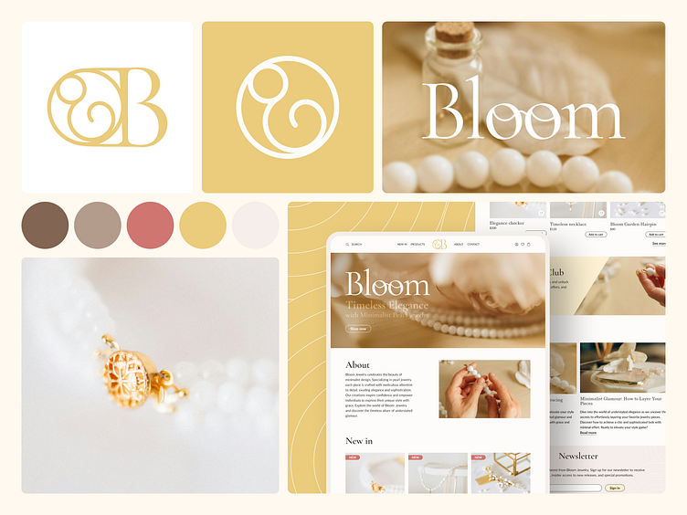
Bloom Jewelry Moodboard
About the project 🎨
Hey!
Today, I’d like to present another branding concept for a small jewelry shop.
The brand focuses on pearl jewelry that embodies elegance and minimalism. Reflecting these core values, I crafted a color palette with warm pastel tones that beautifully complement the pearls and gold accents, adding a soft, refined touch. Circular shapes in logos and illustrations, reminiscent of pearls, are used throughout the design on clean, spacious backgrounds, creating a sense of balance and harmony. The photography style emphasizes Bloom's commitment to elegance, with soft, natural lighting enhancing the jewelry’s beauty. Close-ups and ethereal compositions highlight the delicate details, inviting viewers into a world of grace and luxury.
Throughout the design process, I aimed to create visuals that underscore the brand’s core values of simplicity and refinement.
