Mobile App UI Design for EdTech: Kids Learning Experience
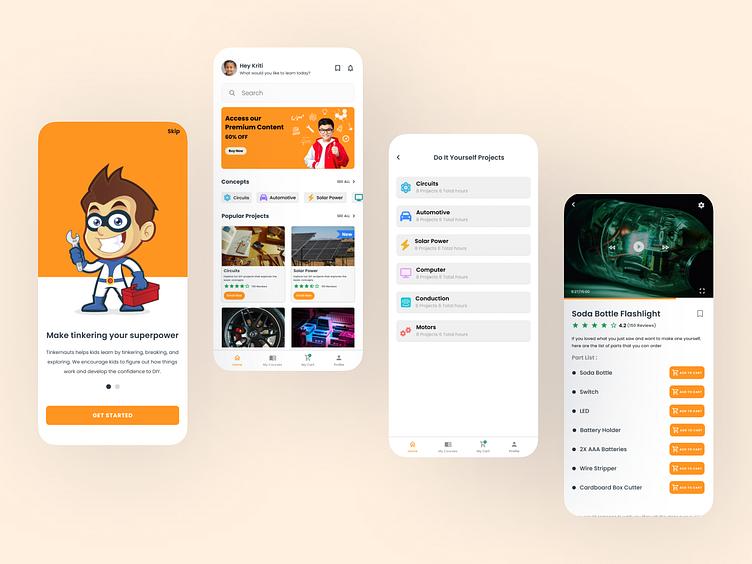
After finalizing the structure with lo-fi wireframes, it was time to bring the design to life with these high-fidelity wireframes. For this ed-tech app, the focus was on creating vibrant, playful, and intuitive screens that keep young learners engaged while ensuring smooth navigation and functionality.
These hi-fi designs reflect the final look and feel of the app, with a strong emphasis on accessibility, user-friendly interactions, and a seamless experience.
Check out some of the hi-fi screens I’ve crafted for this project, designed to make learning fun and interactive for kids!
Hope you like it & press "L" to show your love ❤️
======================================
Interested in working together? Let’s chat!
📬 Mail: dikshagoel2005@gmail.com
More by Diksha goel | UI/UX Designer View profile
Like

