KOCHINO | LOGO DESIGN & BRAND IDENTITY
The Kochino Spicy Noodles brand was born with the mission of bringing customers a new and unique culinary experience from the signature spicy noodles. Kochino focuses on combining the traditional flavors of Korean cuisine with creativity, aiming to create dishes that suit the taste of Vietnamese people.
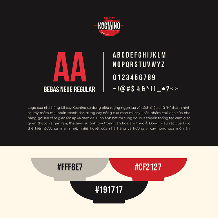
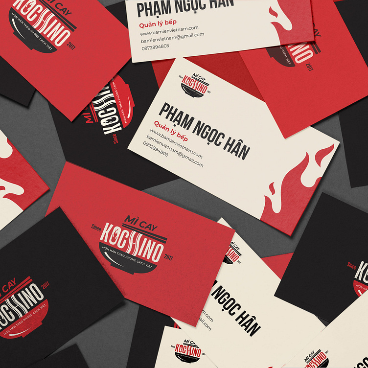
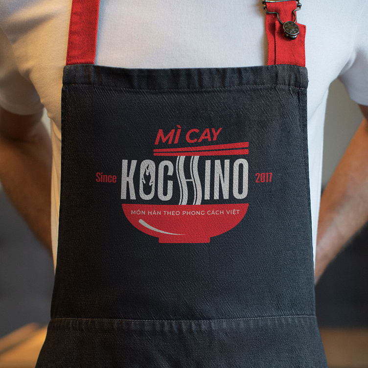
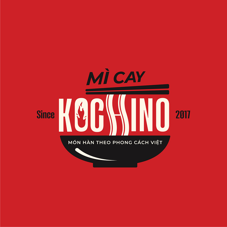
The Kochino Spicy Noodles brand identity was designed by Bee Art using 2 colors, black and red, with strong contrast, contributing to clearly portraying the brand's personality. Red represents the passion and enthusiasm of the brand owner. In addition, red also represents the spicy, rich taste - a characteristic of the main dish that the brand provides. While black represents luxury and sophistication, creating a sense of professionalism and modernity. This combination not only creates a strong visual impression but also helps the brand stand out among competitors.
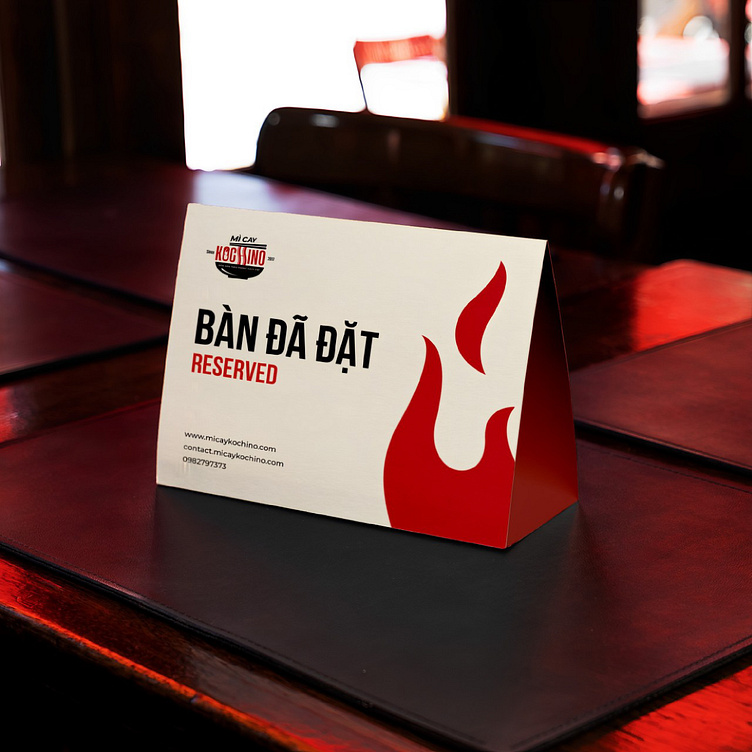
The Kochino logo is designed with the symbol of a bowl of spicy noodles symbolizing the main product that the brand provides. The letter O is designed using the symbol of a flame, combined with the image of noodles stylized from the letter H in the brand name. This clever combination helps the brand strengthen its business products as well as create a unique highlight for the logo.
--
Designed by Bee Art
-
Client Mì Cay Kochino
Logo and Branding Project. Logo is designed for Beauty Spa in Vietnam.
Copyright © Bee Art. All Right Reserved
Contact us:
• Hotline/ Zalo: (+84) 77 34567 18
• Email: info@beeart.vn
• Website: www.beeart.vn
• Facebook: https://www.facebook.com/BeeArt.vn