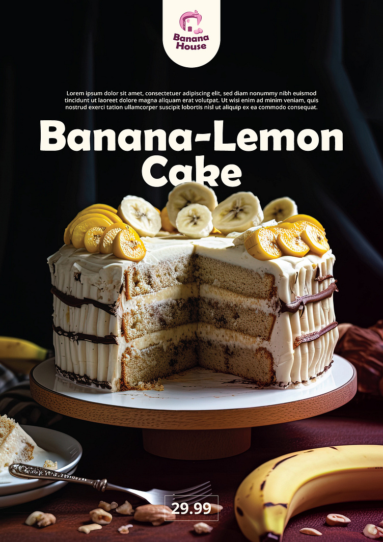
Banana House Typography
Building on yesterday's logo design, today it was all about typography and how to present it. To this end I shared a few examples of how this brand would use it's type. I decided to leverage the logotype as it fit the style I wanted to be used in the headlines perfectly. It's bold, minimalist, but also a bit playful. This gave the brand the luxurious touch I was looking for, which is why I decided to also simplify the logo.
More by Bogdan Vezeteu View profile
Like


