Ligther - Experimental App Design
Lighter - Wireframes & UI
Lighter is an experimental design project I created to practice my UI Design skills on Figma.
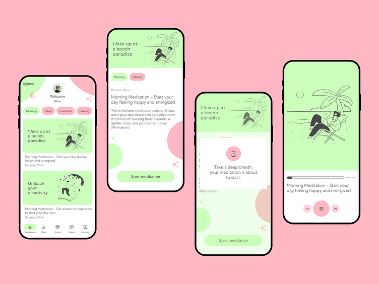
It is a meditation app that curates relaxing content for its users. The content is mainly audio, so designing a media player was a must.
This concept app consists of a total of 5 screen designs, which are not all displayed here:
Home screen
Meditation page
Countdown modal
Audio Player
Completion modal
The final UI looks quite different from the wireframes as I tested the flow and decided that it was best to keep the user focused on one task at hand, so I ended up removing the fixed navigation menu.
The UI has a few different components including the meditation cards, category pills, a nav bottom bar, modals, player buttons and progress bar, avatar, etc. Some were designed by me, and others were taken from the Material You Design Library.
Below, you can check the before and after.
Still a lot to learn and practice, but what are your thoughts? :)
Lighter - Prototype
The user flow for this experimental project is quite simple: select meditation, start, relax, and finish.
My idea for this flow is to try and keep the user focused on the task at hand, which is to relax and meditate, away from further distractions (in the real world and in the app itself).
The user is guided through simple modals at the start of the meditation and at the end of it.
What do you think? :)
Resources
Fonts:
KyivType Sans
Kumbh Sans
Colors:
CCFFBC (light green as the primary color)
FFB7C3 (bright pink as secondary color)
474747 (grey for text)
Illustrations:
Vector illustrations by Streamline
Icons:
Components:


