Infomist - Landing Page UI UX Design
About The Project & Requirement
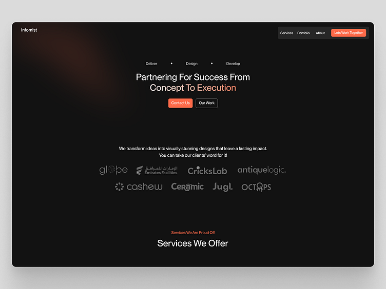
The Infomist is a design and development agency. The client wanted a clear, informative platform that engages the users with a techy and dark vibe to the website.
Here's the old design: www.infomist.com/
My Research & Approach
I first noticed that the hero section wasn't clear about what the agency was offering. I saw the old design lacked hierarchy and harmony in every section. The website had a lot of irrelevant content, making it difficult for the user to focus on the main things.
I updated the hero section of the website to make it clearer and showcase the agency's offerings. Then, I improved the overall website navigation and usability and streamlined the content by removing unnecessary elements for a better user experience.
My Redesign:
Loved this?
Follow me to get daily inspiration for web design.
Have a project? Email me at:
Portfolio
https://www.behance.net/mustafatahir2
Behind the scenes

