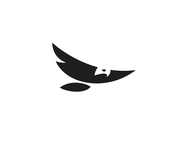
Swoosh Eagle
I've been working to simplify the eagle design as much as possible. Removing the eye and the left cut might simplify it further, but I want to keep it recognizable.
What do you think? Is it simple enough?
This is a piece from my recently launched Negative space logo 7 logo collection on Behance.
https://www.behance.net/gallery/207826867/Negative-yet-Positive-7
For a project reach out to me at daniel@kreatank.com
Kreatank.com l Behance l Instagram l Facebook l X | LinkedIn
More by Daniel Bodea / Kreatank View profile
Services by Daniel Bodea / Kreatank
Like
