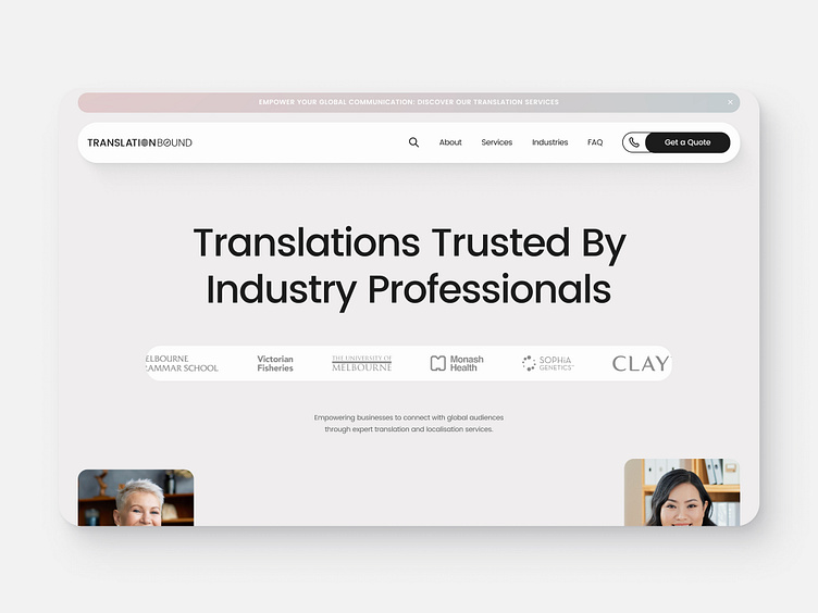
Website Redesign for Translation Bound
Client
Translation Bound
Role
UX Designer
Year
2024
⬇️ Full page at the end ⬇️
Overview
Translation Bound approached me to redesign their website, aiming to modernise their online presence and better reflect their expertise in providing translation services across multiple industries. The goal was to create a cohesive, professional, and user-friendly platform that appealed to both individual clients and businesses seeking translation services.
Problem
The previous website didn’t fully communicate Translation Bound’s range of services or their credibility within the industry. Key pain points included difficulty navigating the services, lack of trust signals like testimonials, and an overall outdated design. Translation Bound wanted a redesign that improved both usability and brand perception.
Approach
I focused on crafting a sleek, modern design that prioritised user experience while highlighting Translation Bound’s industry expertise. A multi-industry focus was key, so the new site features easy-to-navigate service pages, with dedicated sections for various sectors. I also integrated trust signals such as client logos, testimonials, and team profiles to humanise the brand and build credibility.
Solution
✷ Improved Navigation: The redesigned website features clear, intuitive navigation, making it easy for users to access services, industries, and the company’s key offerings. The inclusion of drop-down menus and a detailed service breakdown ensures that users can quickly find relevant information.
✷ Industry-Specific Sections: The redesign includes specific sections for industries served, allowing potential clients to quickly identify the services that meet their needs.
✷ Client Logos and Testimonials: The homepage highlights industry-leading clients and testimonials from satisfied customers, building immediate trust and authority.
✷ Meet the Team: A dedicated section introduces the translation experts behind the brand, creating a personal connection with potential clients.
✷ Modern Visual Design: The new design is minimal and clean, with a focus on high-quality imagery and a colour palette that conveys professionalism and trustworthiness.
✷ Mobile Optimisation: The redesign is fully responsive, ensuring a seamless experience for users across all devices.
🗣️ Full Page 🗣️
Thanks for stopping by! 👋
If you'd like to connect or reach out, I'd be happy to chat:


