Maneo Skincare Rebrand & Packaging Design
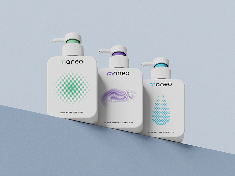
Introducing the full rebrand and packaging design for Maneo, a science-backed skincare brand. Our goal was to create a minimal, clean design that reflects the clinical efficacy of Maneo’s products while appealing to urban and suburban consumers aged 25-45.
Project Highlights:
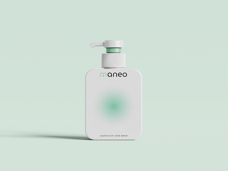
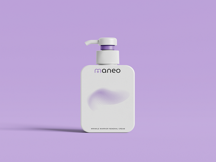
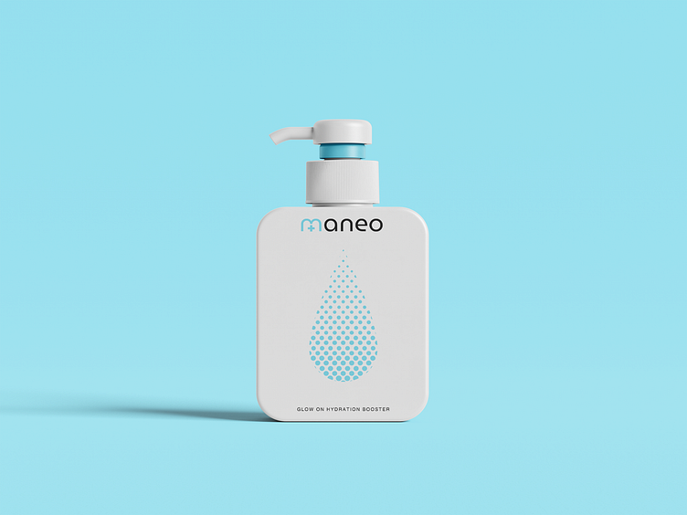
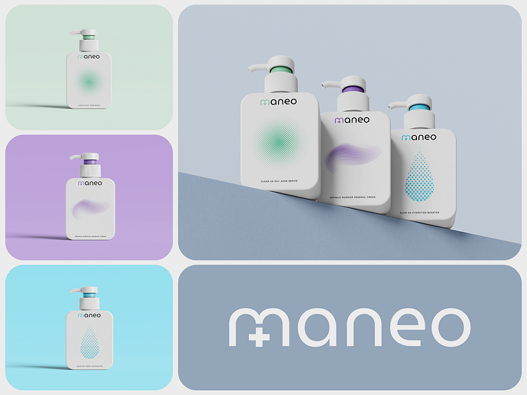
Packaging Design: Clean, white bottles with halftone graphic elements in soft, distinct colors for each product line:
Acne: Mint green (#a7d6ba) for a fresh, healing vibe.
Aging: Lavender (#a58ac8) for a luxurious, rejuvenating feel.
Hydration: Cool blue (#7fd1e5) for moisture and refreshment.
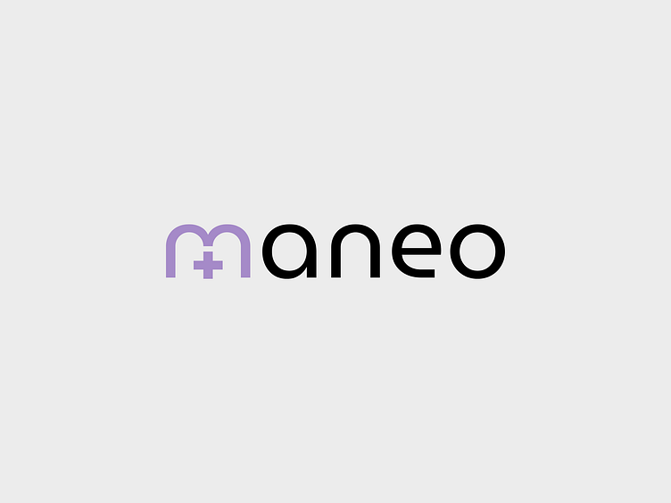
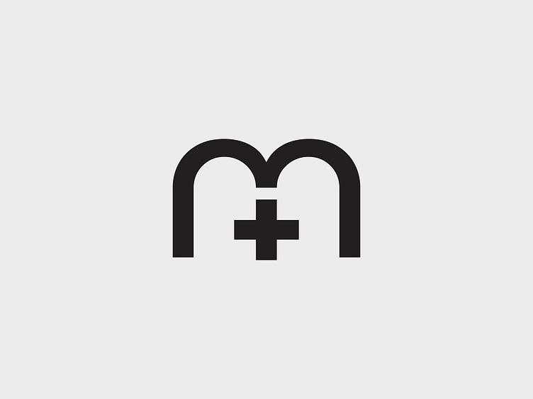
Logomark: The lowercase "m" from the font Museo Moderno, altered with a "+" symbol in the middle to subtly nod to the science behind skincare. This logomark fits perfectly into the wordmark "maneo," creating a cohesive and versatile brand identity.
Color Psychology: Each color was carefully chosen to align with the product's purpose while maintaining a clinical and professional tone.
Our design focused on blending the minimalist beauty of skincare with scientific precision, creating a brand that’s as effective as it is beautiful.
Let us know what you think in the comments!