A Responsive Volunteering Site
I designed a responsive volunteering dashboard that offers personalised matches and quick applications from any device. By reducing time on the application process, I improved user engagement and streamlined the overall recruitment process.
PROBLEM
Volunteering and job-hunting platforms often lack quick application processes and personalized recommendations, hindering career growth. Many users abandon applications after encountering lengthy and cumbersome steps, particularly when these platforms are not optimized for mobile devices, making it difficult to apply from phones or other mobile devices. This results in missed opportunities for both candidates and employers
SOLUTION
Design an interface for a volunteering site that offers personalised opportunity matches and allows applications with a few clicks from any device
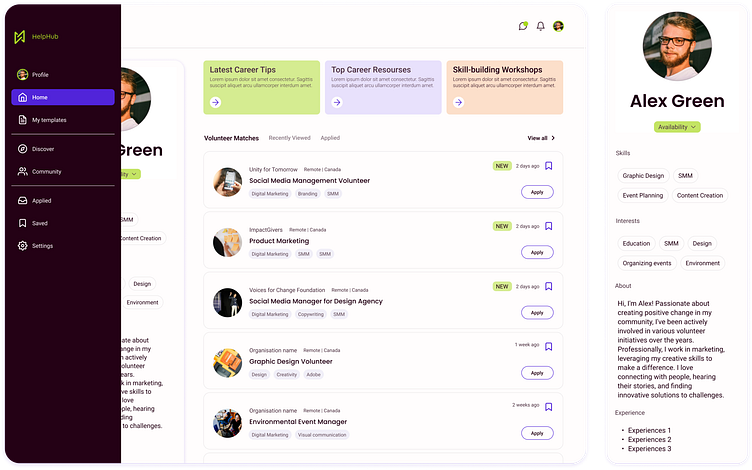
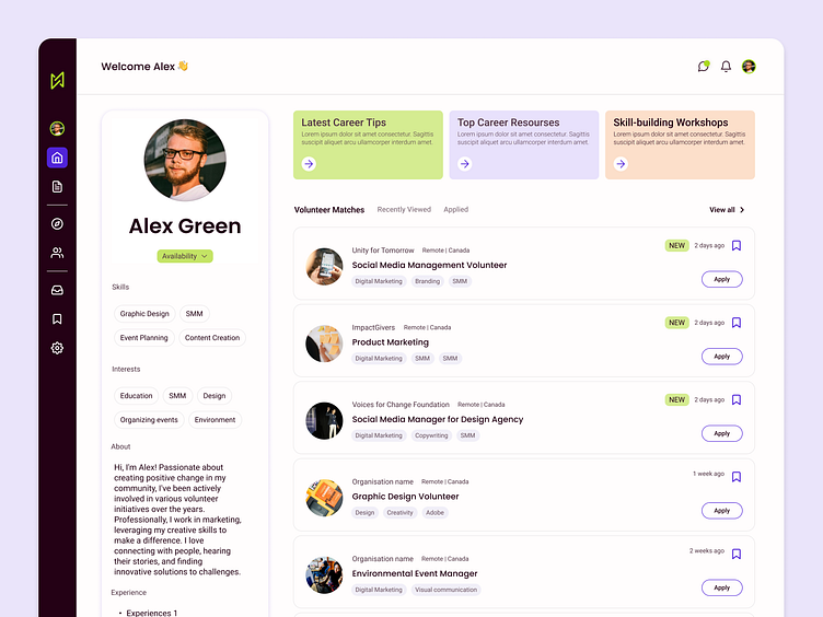
SMART MATCHES
Users can edit their key information, such as skills, which allows their volunteer matches to be updated in real time. This ensures that the volunteer opportunities displayed are always relevant and accurately reflect their current qualifications and interests
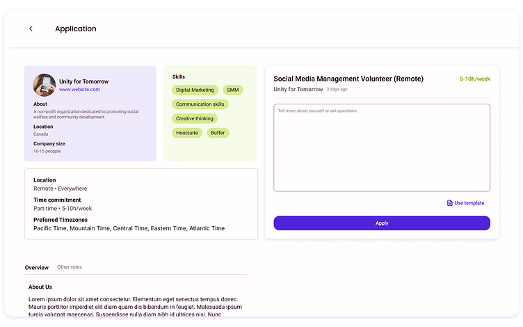
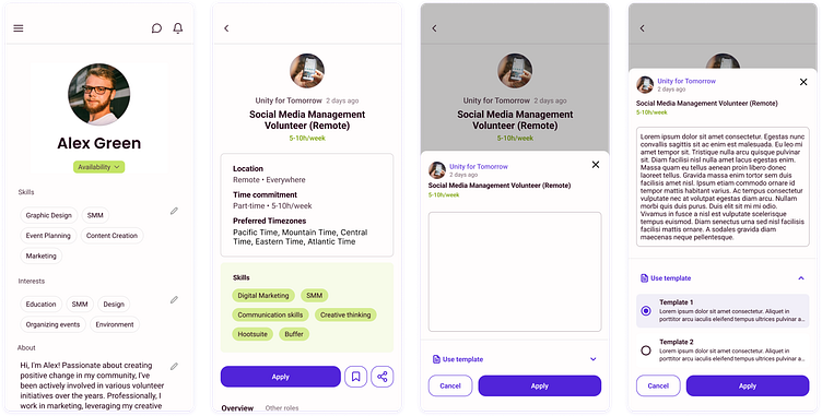
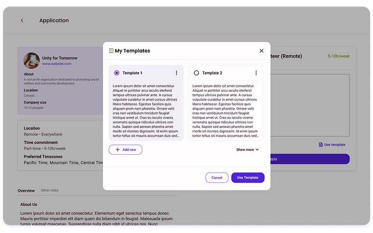
APPLICATION WITH TEMPLATES
When applying for a role, users can select from their pre-filled templates, enabling a faster and more convenient application process. The feature allows users to tailor their submissions, reducing the time and effort to complete the application
SAVED PROGRESS ACROSS DEVICES
1. Users can apply from mobiles devices with the same amount of clicks as on desktop;
2. Users can also continue applying from a mobile device, ensuring that the progress is saved. This approach maintains a seamless user experience across devices, allowing to navigate and complete their applications with the same level of efficiency.