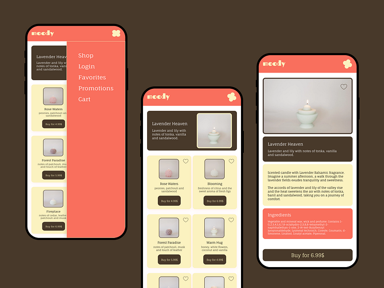
Moody - Experimental UI Design Project
Moody - Wireframes
Moody is an experimental UI design project I created to practice my design skills on Figma.
First, I developed a website hero section as an experiment but decided to try and transform it into an actual E-commerce app.
This is an example project, so it only consists of 3 simple screens and user interactions:
Home Screen
Menu Navigation
Product Page
The wireframes look like this:
Moody - Look & Feel
Below is the final UI design of the three scenarios represented in the wireframes.
The UI design concept is simple: a main section highlighting the best seller, followed by the remaining products represented in rectangular cards. All the cards follow the same Figma component, with a "Favorites" icon on the top-right corner, a title, a description, and a button to shop.
For the menu navigation, the user clicks on the top right icon in the main fixed menu, and a sidebar opens with all the remaining pages of the app. The interaction consists of a slider while the icon changes position upon opening.
All the Product cards are clickable, leading to a product screen with all the information about the candle. 4 different sections provide different information in the following hierarchy: Image - Intro - Description - Ingredients - Call to Action.
Moody - Prototype
Below is the final result of this simple design experiment.
What do you think? :)


