N Logo, Arrow Logo, Brand logo, Logo design
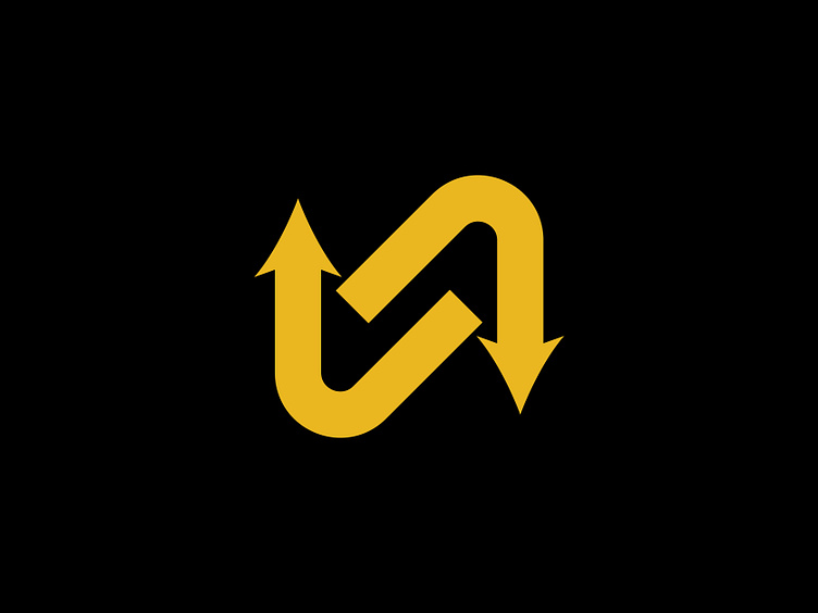
Here's a new logo concept I designed, featuring a combination of the letter "N" and arrows. The design showcases two arrows—one below and one above the "N"—creating a dynamic and balanced feel. The upward arrow symbolizes progress, growth, and forward momentum, while the downward arrow represents stability and grounded strength.
This minimalistic and versatile design works well for brands that focus on movement, technology, or even logistics. Let me know what you think of this concept!
Do you have a project? Let's work together!
Contact me at: designerbadhon22@gmail.com