Batlab™ - Health Care Logo & Branding - Medical Pharmaceutical
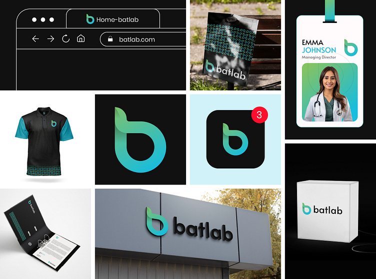
Just completed a fun rebranding project for batlab™, a popular hospital, as a creative demo!
Although it wasn't for a client, I took the opportunity to explore new ideas and bring a fresh perspective to their brand identity. From designing a sleek logo to creating a cohesive design system, I focused on blending innovation with compassion to reflect the essence of healthcare. 🏥💡
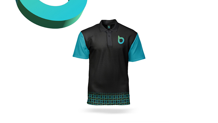
Concept: Alphabet " b "+ Leaf icon
Color Psychology: Blue and green are popular colors for healthcare brands. Blue symbolizes trust, calmness, and professionalism, while green represents health, growth, and healing. Together, they create a sense of safety, care, and wellness, making them ideal for healthcare branding.
Press "L" to show your love ❤️️
____________________________________________________________________________________________________
👉 Say goodbye to ineffective logos - Branding Design and hello to a design that’s both memorable and recognizable!🌟
💡 Follow for more update: Behance