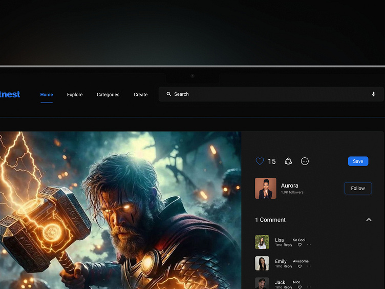
DAY 10 - SOCIAL SHARE | 100 DAYS UI CHALLENGE
Day 09 UI Challenge - Social Share Button
For Day 10 of my 100 Day UI Challenge, I designed a social share button optimized for e-commerce product sharing, featuring a sleek and modern dark theme. The goal was to create a share button that feels seamless and intuitive while fitting perfectly into a dark interface.
Key Features:
🌑 Dark Theme Elegance: A clean, dark background (#1C1C1E) paired with soft gray accents and a pop of color for the share icon. This creates a smooth, visually striking contrast that’s easy on the eyes while maintaining focus on the product.
📦 Tailored for E-commerce: Designed specifically for e-commerce platforms, this share button integrates smoothly into product pages, encouraging users to share with just one click, without distracting from the shopping experience.
🔗 Minimalist Icon: The share button features a bold, minimal icon with sharp edges and sleek lines. In the dark theme, the icon is illuminated with a subtle glow, drawing attention without overwhelming the user interface.
🌗 Accent Colors: The icon features a vibrant accent color, like electric blue (#007AFF), creating a striking contrast with the dark background. This ensures the button stands out while keeping the overall design sophisticated.
📱 Cross-Platform Integration: Whether sharing via Pinterest, Instagram, or other platforms, the button's design is simple and functional, ensuring smooth interaction and high usability across devices.
💡 Balanced Layout: I’ve paired the button with a right-side menu featuring additional interactive elements, balancing the dark theme's modern aesthetic with product images on the left side, providing a cohesive design.
🔗 Effortless Sharing: The button enables users to instantly share their favorite products, with a design that enhances the user experience by being both visually appealing and highly functional.
Working on this social share button in a dark theme was a great way to explore a sleek, minimalist design approach. I’d love to hear your thoughts on the dark theme—what’s your go-to theme for product sharing?


