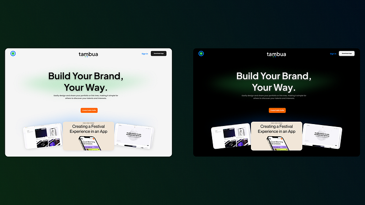
Landing Page - Light & Dark Mode Design
Description:
Here's a concept for Tambua, a platform that empowers users to build and share their personal brands. This design explores both light and dark modes for the landing page, ensuring a visually striking experience regardless of user preference. 🎨
Key features:
Clean and modern interface for easy navigation
Bright call-to-action buttons to drive user engagement
Balanced typography to maintain focus on the content
I aimed to create a design that feels approachable yet professional, suitable for users looking to showcase their portfolios or link trees effortlessly. Let me know which mode you prefer – light or dark! 👀
Press 'L' if you love it! 💙
More by Moloko Chris Poopedi View profile
Like
