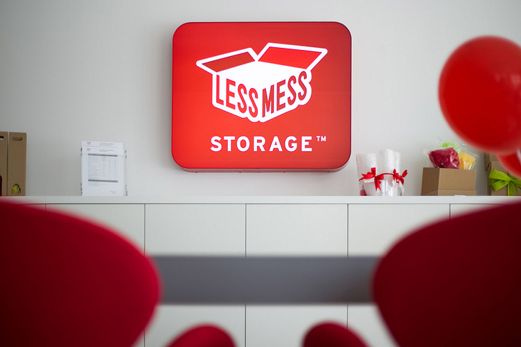
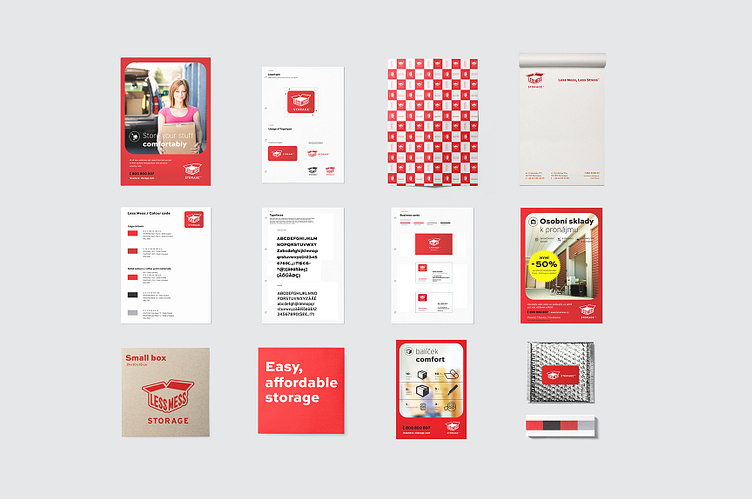
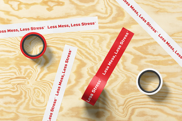
Self storage chain brand identity
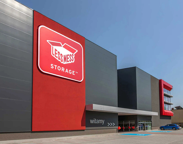
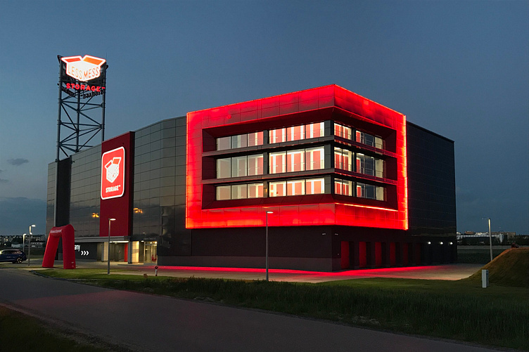
When the brand entered the market in 2014, the self storage industry was not established in Central and Eastern Europe. A clear and distinct visual identity was therefore important. Lightness and fun were also important as elements of the brand’s image.
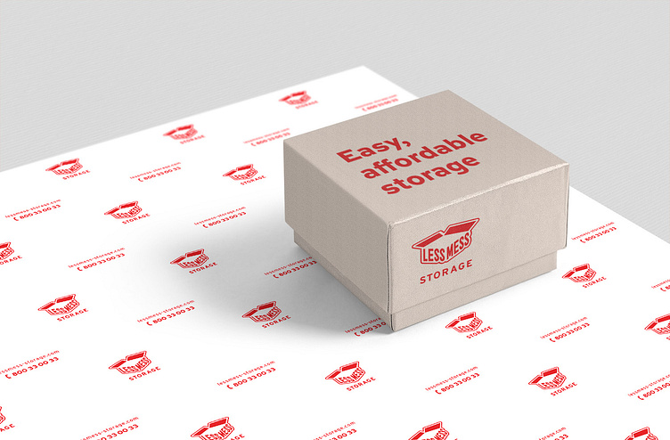
We designed the brand logo and its visual identity. The logo refers to a motif characteristic of storage: a box. This clearly communicates the essence of the offer. text here...
Enter yourWhen the brand entered the market in 2014, the self storage industry was not established in Central and Eastern Europe. A clear and distinct visual identity was therefore important. Lightness and fun were also important as elements of the brand’s image.
We designed the brand logo and its visual identity. The logo refers to a motif characteristic of storage: a box. This clearly communicates the essence of the offer. text here...