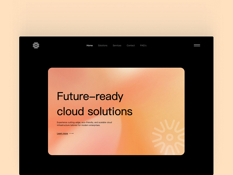
SaaS hero section
🚀 The goal was to create a clean, modern, and professional design with an emphasis on simplicity and clarity. This minimal approach ensures a smooth user experience while focusing on the core message—future-ready cloud infrastructure.
🧠 Design Highlights:
Typography: A bold, elegant font was chosen to emphasize the headline and key messaging.
Color Palette: I went for a warm gradient background to provide a welcoming and friendly atmosphere, balanced by a sleek, dark interface for contrast and readability.
Layout: Minimal and intuitive, with a focus on a prominent call-to-action button for easy navigation.
Iconography: Subtle design elements, like the icon in the corner, were used to add a bit of personality without overwhelming the visual.
Let me know what you think! 💬

