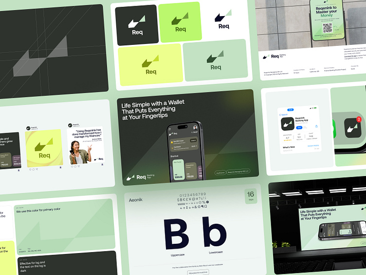
Reqenink - Brand Guideline Design
Hello 👋
I’m thrilled to share the third shot in my Reqenink design series, following the app and web concepts from my previous posts. This time, I’ve created a comprehensive style guide for Reqenink, showcasing the brand’s visual identity.
In this shot, you’ll find a breakdown of the logo design, colour palette, font choices, and how they combine to create a cohesive, modern look for the brand.
About the Client and Their Business Field
Reqenink is a cutting-edge, AI-powered banking platform designed to transform the way young people save.
With a focus on making financial management more intuitive and enjoyable, Reqenink offers a seamless, tech-driven experience that modernizes traditional banking. The app streamlines saving and helps users reach their financial goals without feeling overwhelmed.
Target Audience
Reqenink is built for young, tech-savvy individuals who are looking for a banking experience that feels as modern and engaging as their everyday lives. Aiming to make saving fun and effortless, Reqenink appeals to those who want to manage their money with ease and excitement, never feeling bored or burdened by the process.
Appearance and Impression
Reqenink embodies a forward-thinking, vibrant, and dynamic personality. The app’s colour scheme revolves around the green, symbolizing growth and vitality. The design language is modern, with smooth, flowing elements that reflect the app’s user-friendly and approachable nature. By leveraging AI technology, Reqenink creates a fresh, personalized experience for each user, setting it apart from conventional banking apps.


