Insurance Mobile iOS App Design Concept
Wanna know the project budget and timeline?
😉 Contact Us at purrweb.com
💜 WhatsApp - shoot a message
Hey! Check out our Insurance App design
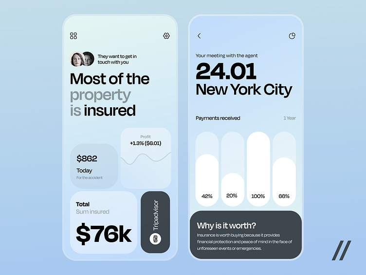
Here, users can get insurance policies and manage them
The shot displays two screens:
The main screen contains general policy information, statistics, and received payouts.
The second screen shows planned appointments and recent payouts.
We created a light color palette with light green and blue accents.
These colors give a sense of peace, trust, and safety. They are also associated with nature and purity. In an insurance app, they create an atmosphere of security and serenity, which are especially important in finance management.
The modern and user-friendly UI makes the process of applying for insurance and its management simple and accessible
The Degular Display typeface is used, taken from Degular from OH no Type Co. .
Photo credits: Matt Reiter and Rachel McDermott (Unsplash).
Press 💜 if you like our design and share feedback!


