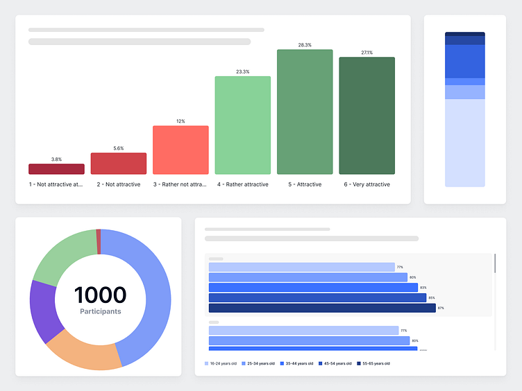
Data Visualization Color System
Color plays a crucial role in making data both beautiful and clear. When done right, it enhances readability, accessibility, and storytelling in visualizations. In this project, I developed a color system that balances aesthetic appeal with clarity, ensuring data is not just seen, but understood.
Categorical palette
The categorical palette is best used for representing data categories that have no inherent order or correlation. This palette is carefully curated to maximize contrast between adjacent colors, enhancing visual distinction. Additionally, the palette is optimized for accessibility, making it distinguishable for users with color vision deficiencies.
Gender palette
The gender palette is an adaption of the categorical palette to visualize all data related to gender. These colors were chosen to move away from traditional gender representations and to promote inclusivity in our visualizations. The selected colors aim to create a more open, diverse visual narrative in our gender-related data.
Sequential palette
Sequential colors convey numeric meaning through a gradation of colors that go from light to dark. These palettes are ideal for relationship and trend charts, where data values need to be visually ranked. In light themes, the darkest color represents the highest values, while in dark themes, the lightest color takes on this role.
Diverging palette
Diverging colors also have numeric meaning and are a pair of two gradations of colors that meet in the center. They’re useful when dealing with ranges that have two extremes with a baseline in the middle.
Traffic light palette
The traffic light palette is a type of diverging palette, particularly effective for highlighting contrasts such as good vs. bad or positive vs. negative due to its clear color distinctions.
Chart color usage
Different palettes are used depending on the content of the visualized data. Appropriate uses of the categorical, sequential and diverging palettes are shown below.


