Portfolio Website UX Design Project
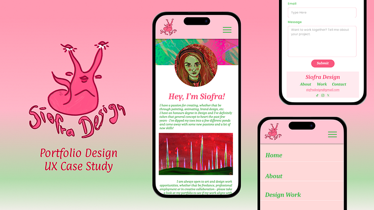
Portfolio Website Design
I’ve been working on my portfolio website continuously the past few years, updating it with recent work, and to represent the kind of projects I am aiming to work on.
Since making UX design my main focus I have undertaken a more structured project with designing my portfolio website - the process is outlined here.
This is still a work in progress!
Research Phase
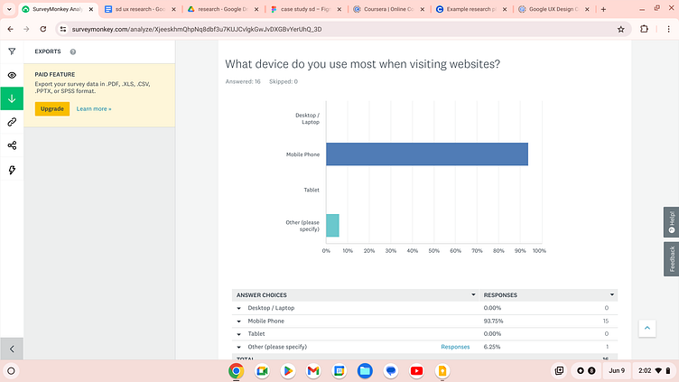
I have been taking a mobile-first design perspective since beginning my UX Design Certification, but also wanted to do my own research to support what people use most when browsing websites
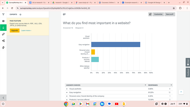
Before starting my design I wanted to get an idea of what people find most important in a website - navigation is by far the most important design consideration for this project
Research Insights
Of those surveyed, when asked what device they use to browse online, the vast majority said that they use a mobile phone when scrolling websites - 94%
Having a dynamic visual aesthetic and pleasing layout makes a difference when browsing online - 57% of respondents answered that they have been swayed or convinced to purchase something online if the website is aesthetically pleasing
The vast majority of those who participated in the survey identified that the most important aspect of a clean website design is the inclusion of clear navigation - 81%
User Persona - Elizabeth

"As a brand management professional working on a big company re-brand, I want to find a creative with both art and design skills who showcases her work in a visually appealing portfolio so that the company can work with her on this upcoming project."
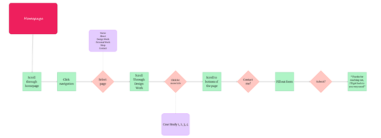
User Flow Diagram
Starting the Design
I went into the ideation phase of this project after collecting insights about the users I am designing for.
I started with lo fi wireframe sketches to get multiple ideas out, then refined them down until I had a rough design for the homepage that i was happy with.
I landed on this rough design, combining both sharp shapes and round ones, to give a variety to the design.
I ended up iterating further on this design when working on my lo fi wireframes but having a rough visual idea to work and build on is a big help.
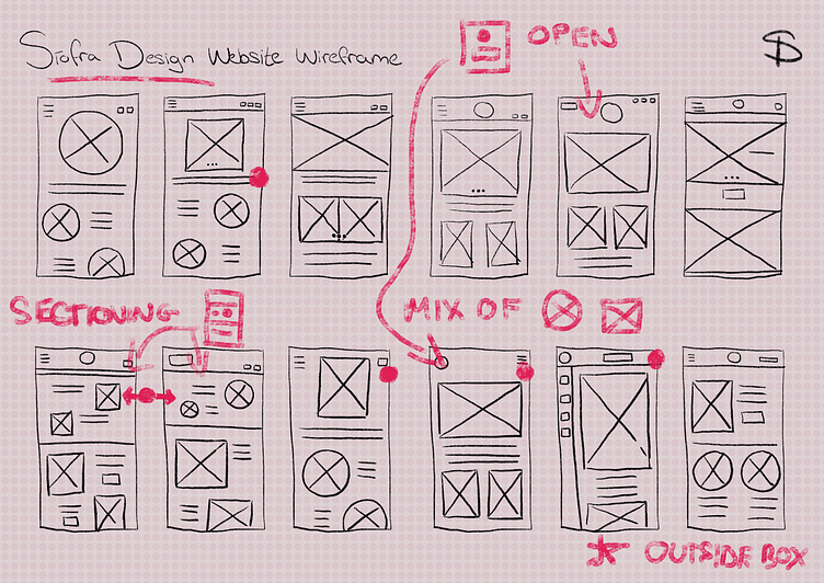
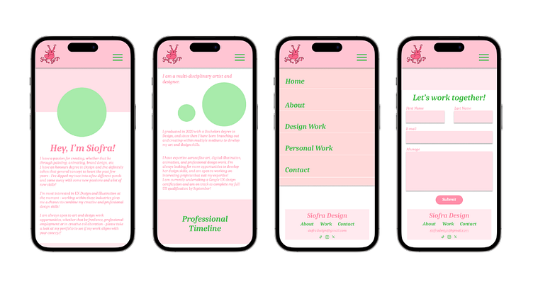
Lo Fi Wireframes
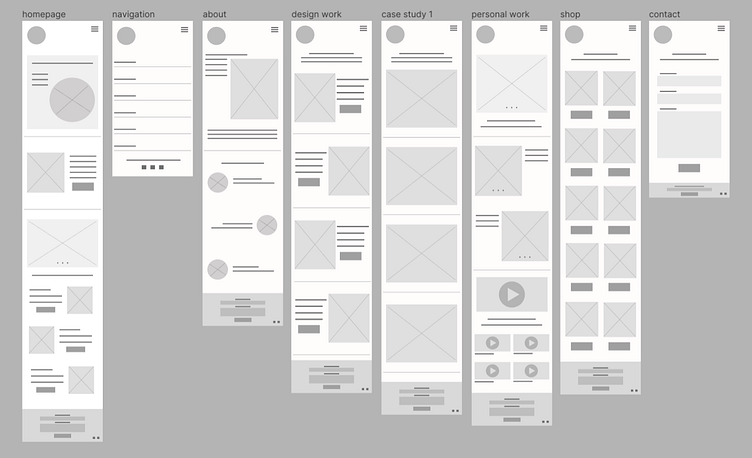
Focusing on the overall design and layout of the page, without using colour or icons/photos
Clickable Prototype
Lo Fidelity click-through of the website, to show rough functionality before building on the design after the first usability study - insights will inform the hi fi design of the website
This will be built upon when refining the design and implementing more detailed interations.
Link to prototype - https://www.siofradesign.com/portfolio/siofra-portfolio-website
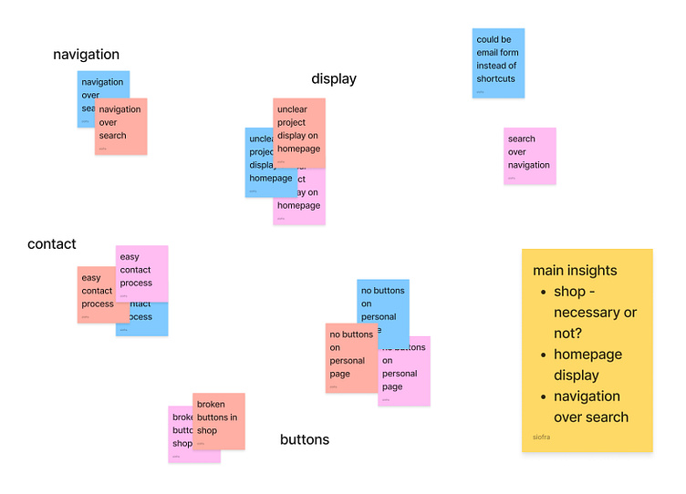
Usability Study 1
Insights
Things were unclear on the homepage immediately about the order that projects were displayed
The process linking the ‘Personal Work’ and ‘Shop’ pages is unclear - Is the separate ‘Shop’ page necessary?
The clear navigation was a high point of the prototype - is there a need for a search bar?
Refining the Design
I started to work on the insights I gathered with my usability study while incorporating more colour and visual style into the website.
From there I continued to refine my designs and then added more specific copy and images
Above is the initial phase, adding colour and refining layout
Adding in specific imagery and icons to build on the visual style of the website was my next step.
This has been a particularly interesting project for me as it is combining my UX Design knowledge with my creative background, and creating something that I want to represent me in both areas.

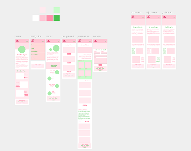
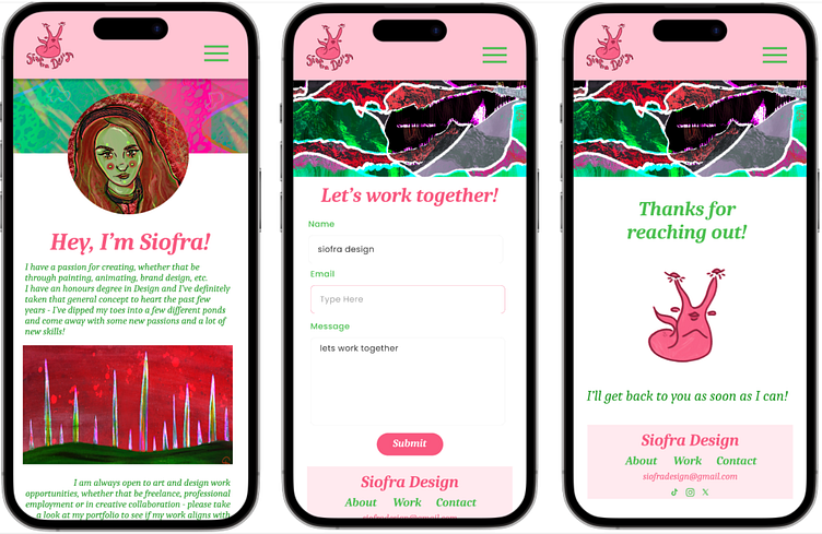
Hi Fi Prototype
Hi Fidelity prototype of the website, showcasing visual style and layout and user flow.
Testing the flow and functionality of the design is so important when it comes to ensuring that the user experience is what we want it to be.
After adding images and refining the consistency of the visuals I was ready for my second usability study.
Link to hi fi prototype - https://www.siofradesign.com/portfolio/siofra-portfolio-website
Usability Study 2
Project background: We want to create a responsive portfolio website for Siofra Design that displays her experience with design case studies and personal work.
Research goals: Make it as simple as possible to navigate the portfolio website and contact the designer directly when wanting to work together.
Moderated usability study
Location - online, remote over Zoom
Date: July 13th and 15th
Five participants will sit down with me over Zoom and complete the tasks set out for them - ie. navigating portfolio website and contacting artist. Sessions will be 20-30min long, and the Zoom call will be screen recorded.
Participants will be both those with expertise in art and design professionally, and those with a more casual interest. Goal is to get the perspective of professionals within various industries as well as laypeople with more of an art focus. Incentives - offering two free art prints from Siofra Design’s online shop.
Main Insights
Contact form is broken and vague
Distinctive visuals but verging on too much
Clear and simple navigation
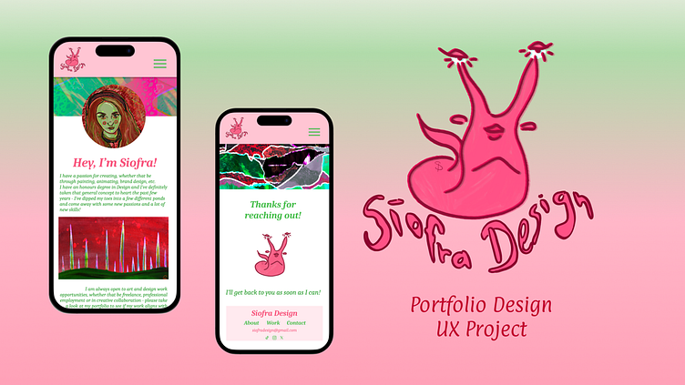
Final Design
After my second usability study I went into refining my final design with the following insights;
Fixing the flow and coherency of the contact process
Thinking more intentionally about the layout of the website; not doing too much while maintaining the visual style.
Having the chance to work on my vision for the design and then get actual useful feedback on how users experience that is so useful within this process.
It is important to go back to the design with that different perspective and refine it.
Accessibility Considerations
Colour Contrast
For the past few years I have been working on my own creative and artistic skills and what I’ve seen come up as a consistent pattern of the use of pink/red and green.
I followed the WCAG guidelines when implementing colour within my designs.
Clear but Stylised Navigation
Due to the fact that this is such a big project, in terms of using my design skills and showcasing my own portfolio within one website.
I wanted it to be as clear and straightforward as possible to navigate this website, while maintaining my own distinct style.
Next Steps
This project has been an especially interesting and challenging one for me in the fact that I am building a portfolio for myself and showcase my skills while also following Design Thinking Principles.
I’m especially proud of this project as I feel that this is a perfect blend of my creative mindset in combination with the design thinking skills I have acquired through my education within Design.
I am open to creative and design work opportunities and am eager to showcase my skills in my next project!
