Thank You - Daily UI #077
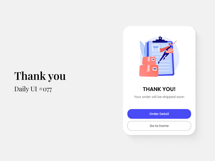
Hey everyone! 🙌 Today’s challenge was all about crafting a seamless post-purchase experience with a Thank You screen that lets users know their order is on the way! 🚚📦
I focused on simplicity and clarity, while keeping it visually engaging with soft colors and intuitive buttons. The goal? To create a positive final interaction for users after they complete their purchase, leaving a lasting impression! 😊
🔍 Key Highlights:
Clean and minimal layout for easy readability
Clear CTAs (Order Detail + Go to Home) for intuitive navigation
Friendly and engaging illustration to enhance user satisfaction
💡 As UI Designers, it’s important to make every touchpoint matter, even after the transaction is done. A smooth Thank You screen is a small but crucial part of creating a memorable UX!
🚀 Looking to collaborate? Drop me a message! I'm open to new opportunities, collaborations, and exciting projects! Let’s create amazing interfaces together!
------------------------------------------------------------------------------------------------------------
Let's talk and Collaborate:
