Perfect Shadow : UI Tips
Hey Dribbble Friends! 👋
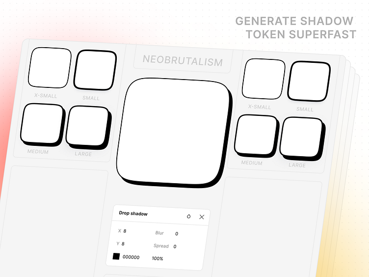
This design showcases the bold style of Neubrutalism, using unique shadow tokens that add depth and personality to your design system. These striking shadows create contrast and elevate your UI, making your designs stand out.
Whether you’re working on a portfolio, website, or app, the right shadow effect can make all the difference. This shot shows how easy it is to add bold shadows that draw attention and bring your elements to life.
Get inspired and try our Identity Figma Plugin to create custom shadow tokens effortlessly. Build stunning design systems with just a few clicks!
Inspired? Hit "L" to show some love!
Designed with ❤️ by team Figr, using Identity.
More by Figr Design View profile
Like

