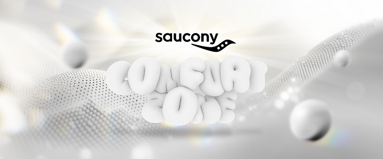
saucony graphic design
Brand Exploration: Saucony brand focuses on sports and comfort, emphasizing the lightness and functionality of its products. This event will revolve around the design features of down jackets and running shoes, highlighting their application in everyday life.
Target Customer Analysis: Core customer group: Young professionals and sports enthusiasts who value fashion and comfort, and prefer a lightweight wearing experience. Consumption characteristics: They pursue high quality, design sense, and comfort, and are willing to pay a premium for lightness and fashion.
Storyline: Centered around the theme of "Exploring in Comfort and Lightness," the narrative will illustrate how Saucony's down jackets and running shoes accompany consumers in various scenarios, showcasing their lifestyle and pursuits. By sharing real customer stories, it emphasizes the brand's values and the multifunctionality of the products.
Chinese Theme Options: Exploring in the Comfort Zone (TBC)
Overall Design Style: Lightness: Use simple lines and open space layout to avoid a bulky feeling, creating a transparent and comfortable environment. Color matching: The main colors are white, blue, and brown, combined with natural elements to highlight a fresh and elegant atmosphere. Material selection: Use lightweight materials (such as transparent acrylic, light wood, LED light strips) to enhance the sense of space transparency and modernity.
Hi there 👋
Check out my portfolio for a glimpse of my creative world.
Follow for updates and let's fuel the fire of creativity together!
👇 Are you interested in working with me?
Looking forward to connecting with you!


