Mastering High-Tech Text-Heavy Design with Precision And Appeal
scalacomputing.com
How it started
When Scala Computing approached us, they needed a website that could convey their cutting-edge technology and professionalism without losing the human touch. The challenge was clear: create a visually appealing and easy-to-navigate design for a content-rich site. Additionally, with only 2.5 weeks to complete the project from design to development, the pressure was on to deliver without compromising on quality.
Harmonizing Layout and Content for Clarity
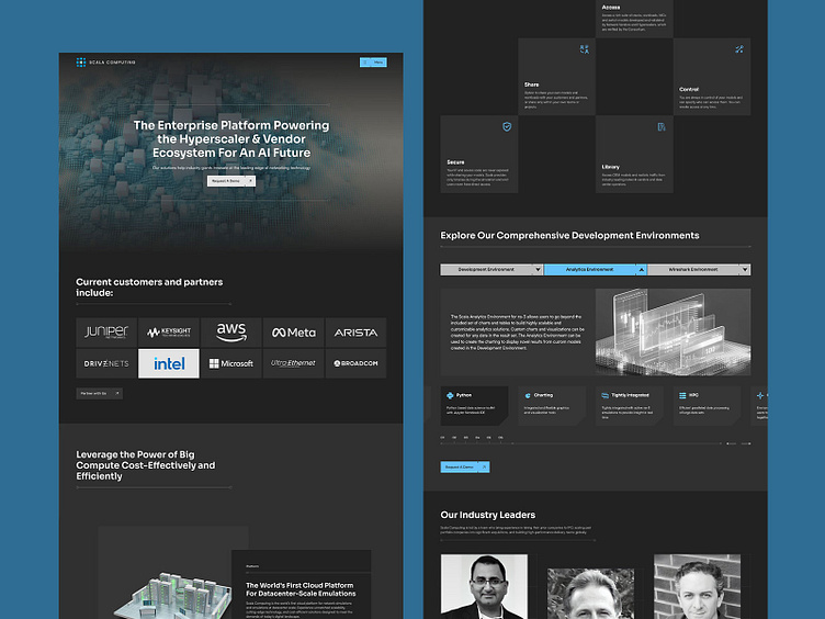
The heart of this project was ensuring that the text-heavy content was easy to digest while maintaining viewer engagement. We tackled this challenge by carefully designing the layout to guide the reader’s eye seamlessly through the information. By breaking up large blocks of text with strategic spacing, headings, and bullet points, we made sure the content was accessible and inviting rather than overwhelming. This approach allowed us to present complex information in a way that kept the audience engaged, ensuring that the content’s depth didn’t translate to boredom.
Injecting Visual Language for a Professional Yet Dynamic Appeal
To elevate the website beyond a standard, text-heavy experience, we introduced a unique visual language that added both professionalism and appeal. Key design elements included a “chessboard” card deck layout, cut-corner cards, and a measuring grid motif. These features provided a cohesive, high-tech aesthetic that was both visually stimulating and in line with Scala Computing’s brand identity. These design choices not only spiced up the page but also reinforced the company’s innovative image.
Enhancing Engagement with Animations and Motion Design
To further enhance the website’s appeal, we integrated subtle animations and motion design. These elements added a dynamic layer to the user experience, making the site feel more interactive and modern. Whether it was the smooth transitions between sections or the animated elements within the “chessboard” layout, these touches kept the user engaged and visually stimulated, turning a text-heavy website into a lively digital experience.
Delivering 12 Unique Pages in Just 2.5 Weeks
One of the most significant achievements of this project was the rapid timeline. In just 2.5 weeks, we designed and developed 12 unique pages, each with its own layout while maintaining a consistent visual language throughout the site. Despite the tight deadline, we ensured that each page was meticulously crafted, visually appealing, and fully functional. This swift execution not only met but exceeded the client’s expectations, demonstrating our ability to deliver high-quality work under pressure.


