userue.com
Project overview
Rue, a tech startup platform, bridges the gap between brands and event hosts, enabling them to find and collaborate with each other seamlessly. When Rue approached nio rio, they needed a solution urgently and expected the project to be completed as soon as possible. After evaluating their needs, we estimated a 2-week timeline to deliver a fully functional 3-page landing page website.
Challenges
Dual-Audience Communication
The primary challenge was ensuring that the website clearly distinguished between messages intended for brands and those for event hosts. Each group needed to immediately recognize which content was relevant to them without confusion.
Visual Appeal
The website needed to be colorful and dynamic to attract both audiences, with visual elements that energized visitors and encouraged interaction.
Clear Product Understanding
Given the innovative nature of Rue's platform, it was crucial that visitors quickly grasped how the product worked, which meant abstracting the product interface into digestible visual assets.
Urgent Timeline
Rue needed the website completed as soon as possible, which required us to work within a tight 2-week deadline. This urgency demanded efficient project management and rapid execution without compromising quality.
Our Approach
Audience-Specific Messaging with Color-Coding
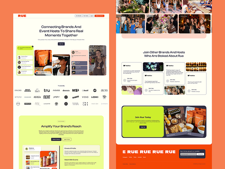
To address the dual-audience challenge, we implemented a color-coded design system. Neon-yellow was used to highlight sections and messages tailored for brands, while peach was used for content targeting event hosts. This subtle yet effective differentiation allowed each audience to easily navigate the site and find relevant information.
Dynamic Visuals and Layout
The website’s design is vibrant and energetic, reflecting Rue's dynamic platform. We used a mix of bright colors, fluid layouts, and interactive elements to keep users engaged. Animations were strategically incorporated to add an element of surprise and maintain the website’s lively atmosphere.
Simplified Product Interface Visualization
To ensure that visitors understood how Rue's platform worked, we abstracted the product interface into simplified visual assets. These visuals provided a clear and concise explanation of the platform's functionality, making it accessible to all users.
Efficient Project Execution
The entire project—from content organization and wireframing to Figma design and Webflow development—was completed within a tight 2-week timeline. Our team’s agile workflow and collaborative approach ensured that the project stayed on track and met Rue’s expectations.
Outcome
The final website successfully met Rue’s urgent needs, delivering a clear, engaging, and visually appealing platform for both brands and event hosts within the tight 2-week deadline. The use of color-coding and dynamic design elements effectively differentiated content while enhancing the user experience, resulting in positive feedback from both Rue and their target audiences.
This project exemplifies nio rio’s ability to tackle complex design challenges and deliver high-quality solutions under pressure. By focusing on the unique needs of Rue’s dual audiences, we created a website that not only communicates their message effectively but also offers a lively and engaging user experience.


