Brand Identity for "Your Reflection"
Brand Overview
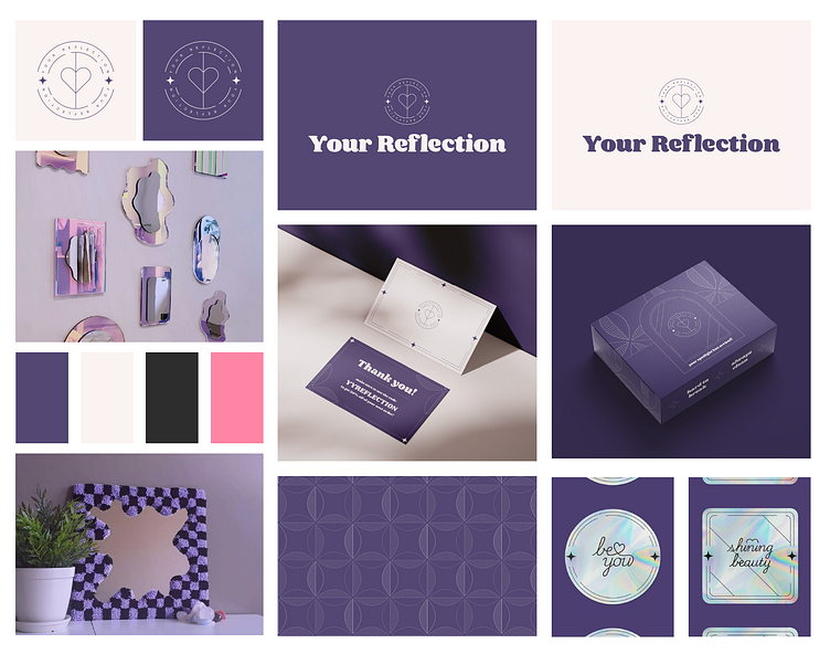
The fictional brand "Your Reflection" is a brand that sells mirrors of diverse shapes. The values of this brand involve playfulness, femininity, reliability, and enchantment—the main quality that sets up the mood. "Your Reflection" is targeted towards an adolescent female audience whose goal is to obtain a mirror that wouldn't just be a piece of glass but a unique decor piece. Additionally, this brand pursues the topics of embracing and expressing yourself and your personality. Therefore, I created the moodboard that would capture these qualities based on the images from Pinterest down below:
Design Decisions
Starting off with the logomark, I decided to take the letter Y and turn it into a heart that aligns with the brand's value of embracing yourself. Additionally, I decided to continue the bottom line of the Y, eventually splitting the heart into two symmetrical pieces that seem to have been mirrored. Then, I added 2 circles and the text that resemble a mirror's frame, along with adding a few stars to highlight femininity and playfulness.
The next step was developing the typeface. After scrolling through and trying out plenty of fonts, I found one that would align with all brand's qualities. However, it required some modifications, so I slightly changed the letters to custom ones.
Then, I decided to create the color palette, so it would be easier for me to design everything else. I laid my eyes on the dark shade of purple and beige as the main colors that mix together pretty well and convey enchantment, femininity, and reliance. Next, I decided to take a dark shade of gray as my secondary color and the pink shade as the accent color, which may be used on a website. I kept the color palette minimalist in order to align everything with the brand's personality.
While I was designing the thank-you card, I wanted it to align with all of the brand's qualities and values. Therefore, the frame on the front side signifies the mirror frame, and the stars were added for the visual interest and to align with the brand's values as well. Next, the back side contains the text with some details, which include the lines and leaves. The lines add to the visual interest while also conveying the femininity of the brand. The leaves, additionally, convey femininity and friendliness while also serving as the visual interest.
The pattern was the next. I had the concept in my mind of this pattern conveying the illusions, as a typical distorting mirror would. Therefore, I decided to create leaves, which show the femininity, and arrange them in a pattern that would be able to make many shapes from different points of view. It can be circles, squares, crosses, and ellipses. Overall, this type of pattern clearly expresses enchantment.
Now to the packaging. I wanted it to convey the reliable trait of the brand that would imply strong mirrors. For this reason, I decided to restrain the logomark within the mirror frame and add the pattern on the top half and the sides of the package for some visual interest and to add more personality. The sign "your spotlight has arrived!" illustrates the playfulness of the brand, enticing the customer to get more involved, which would more likely prompt them to return. Additionally, the signs "always clean" and "hard to break" illustrate the main qualities of the product, with the stars added for some visual interest.
Finally, to the stickers! I made them holographic so that they resemble a real mirror. Additionally, I designed and added the frames on the borders to make them look like cute little mirrors even more. And, eventually, I used some custom typography to write affirmations that align with the brand's values.
That's all! Since it is a fictional brand and I did not have a client to work with, this project took me around a week to develop.

