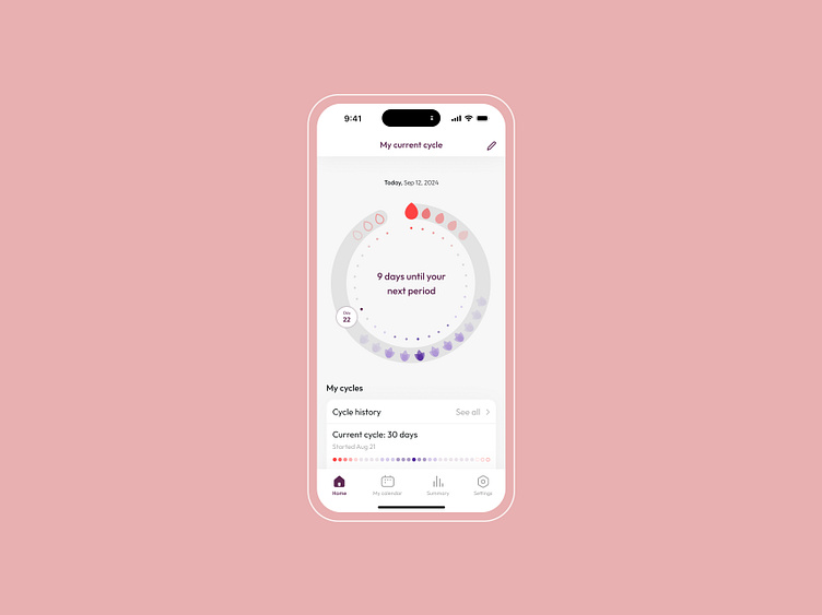
DailyUI #018 - Analytics Chart
DailyUI challenge #018.
Today's prompt was to design an Analytics Chart.
I chose to create an analytics chart for a women's period tracking app. Here, you can see the app's home page featuring a doughnut pie chart that represents the current cycle. Dots inside the chart indicate the number of cycle days. Red drops signify active period days, while empty drops represent possible upcoming period days in the next cycle. The purple lotus on the chart marks ovulation days, with a brighter color indicating the peak of the ovulation phase.
The home page scrolls down to provide more important information and useful articles.
I aimed to keep the overall design clean and simple with pleasant, calming colors.
Thank You!
More by Elizaveta Chrestoff View profile
Like
