29/32 – Salt Lake Hornets
Feel the Sting
The first team in the Canyon Division of the West Conference – the Salt Lake Hornets.
Salt Lake has established themselves as one of the elite passing offenses in the league, landing in the top-5 in the past 6 seasons. They've seen some success as well, reaching the playoffs in 5 of those campaigns that included 3 division titles. Despite this, the Hornets have always been in the shadow of their more successful division rival, but their West Conference championship appearance last season may be the precursor to a new regime at the top of the division.

Visual Direction
Utah's state nickname is the "Beehive State", a name that represents the work and cooperation that was required to build a successful community before Utah was officially established. While technically not classified as a bee, the team name "Hornets" is a more intimidating spin on the state's nickname. Hornets are also notoriously known for aggressively defending their hives, akin to the battles on the gridiron.
The Salt Lake Hornets are a relatively newer franchise, relocating a couple different times before building a nest in the West. They previously included "City" in the team name but have since gone for a simpler approach as other Salt Lake-based sports teams have in the past.
Execution
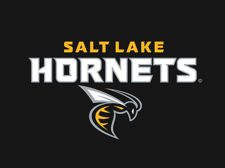
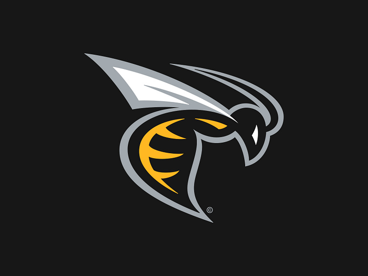
The primary logo for the Salt Lake Hornets depicts a yellow-striped hornet in a dynamic profile pose with its stinger readied for attack. The hornet was designed specifically to fit the contours of today's modern helmet designs, with its wings and stinger meticulously angled to avoid clipping areas caused by helmet vents.
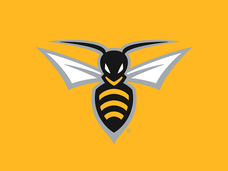
The Hornets' secondary logo illustrates the hornet from the primary in a front-facing view. This iteration is mainly used to supplement the role of the primary logo and is designated to specific areas in the stadium art.
In the tertiary spot is an "SLC" monogram in a hexagonal container shield. In this instance, the "C" for "City" is included as an homage to where this team calls home – Salt Lake City. The shape of the shield is an obvious allusion to the hexagonal honeycomb structure that refers to the cells and passageways that make up a hornet nest.
For the typography, the Hornets use a square sans typestyle as a base that incorporates pointed serifs that mimic the stylings of the primary hornet logo. Additionally, hexagonal references are present in counters of letterforms and angled terminals, borrowing from the same inspiration as the tertiary logo. For the "Salt Lake" and "Hornets" wordmarks, these letters are outlined in the same silver as the rest of the logo suite.
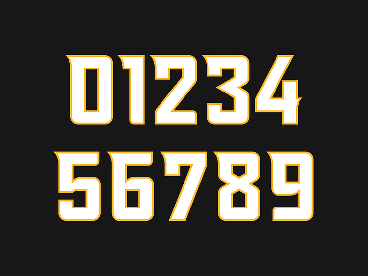
The jersey number set is an extension of the team's typography – building off of the same frame as the team wordmarks and incorporating the same pointed serifs and hexagonal references.
Protect the Hive
As the Salt Lake Hornets look to maintain their recent on-field success, the do so with a recharged graphic suite and visual identity as they embark on a new campaign to protect the hive.
Football Helmet Mockup by SportsTemplates
____________________