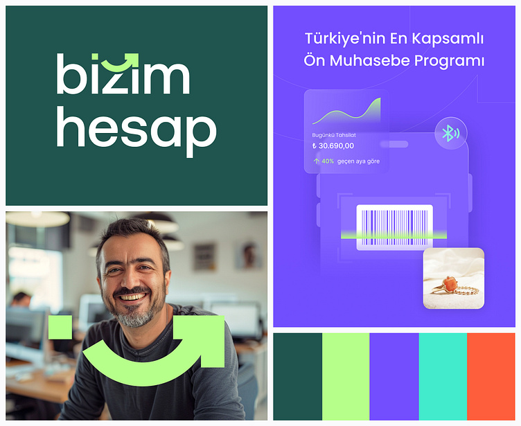
Bizim Hesap: Branding
I’m very excited to share the new logo and website of Bizim Hesap, which I’ve been working on for quite some time. 🎉
Throughout the design process, I aimed to reinterpret the brand's story and mission in the most impactful, modern, and innovative way by utilizing the power of color, typography, and visual language. Our goal was to carve out a unique space in the industry and present a more professional image.
We designed a logomark that combines the warmth of the word "Bizim" (which means "Ours" in Turkish) with a smiling face, and the purpose of helping our users take their businesses forward with an arrow moving ahead. This allowed us to create a brand identity that is both unique and meaningful. Combined with our new color palette, it gave us incredible flexibility in both print and digital communications.
Right after establishing our brand identity, we rolled up our sleeves to redesign our website. As a team, we tackled more than 50 pages from scratch, covering content, design, and technical aspects, with the goal of delivering a user-friendly, functional, and aesthetically pleasing experience. Throughout the website, we aimed to strengthen the design language by using custom illustrations and a photo library that we specifically created to align with our target audience.


