LA CANTINE – Logo & Graphics
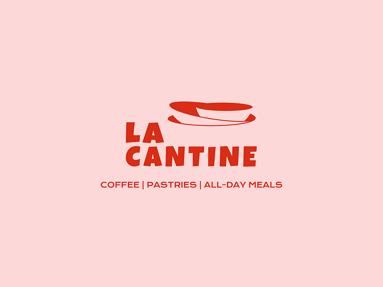
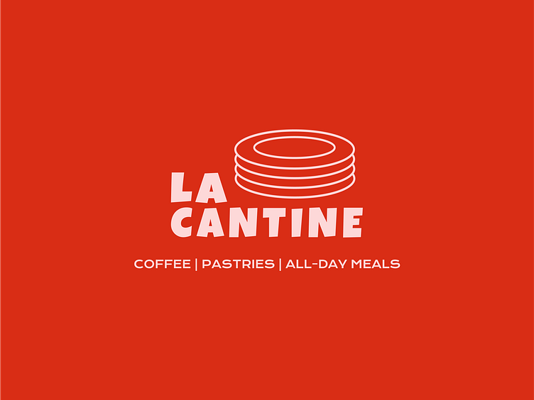
Introducing the logo for LA CANTINE – a contemporary café on the French Riviera. Inspired by traditional southern dishes, the concept embodies a playful and approachable aesthetic, perfect for everyday dining. The café offers all-day breakfast options and hosts various cultural and social events in the evenings.
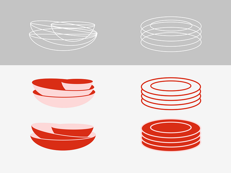
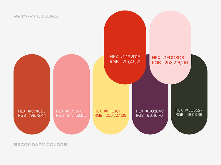
Logo Construction and Color Palette
Two interchangeable logos, with clean lines and dynamic arrangements, offer adaptability, embody simplicity and warmth. Paired with a vibrant, warm color palette, it features bold primary colors that create contrast and secondary colors that offer flexibility. This combination serves as a tool for crafting a memorable and engaging visual identity that appeals to various age groups.
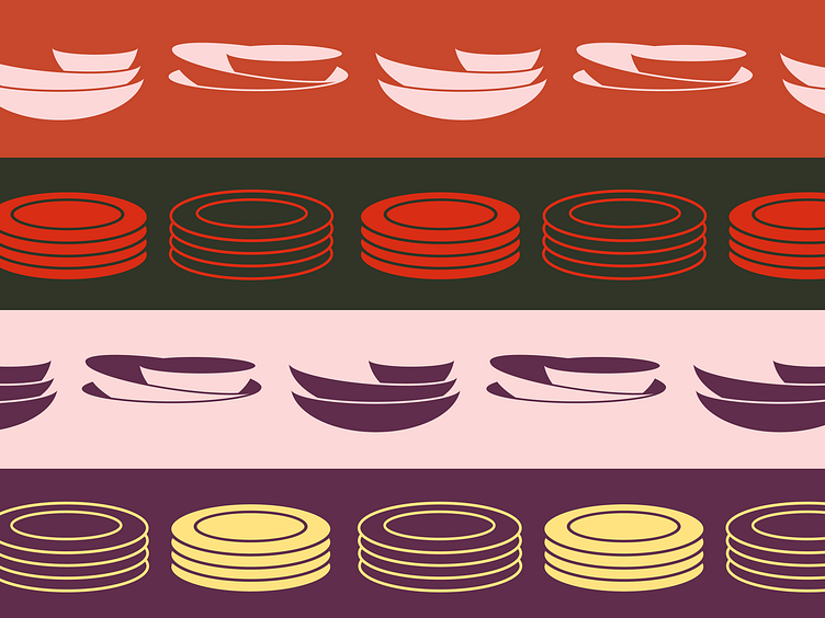


Creating a Graphic Pattern
The development of a graphic pattern involves designing a visually cohesive element that can be seamlessly integrated into various brand materials, enhancing overall consistency and aesthetic appeal.


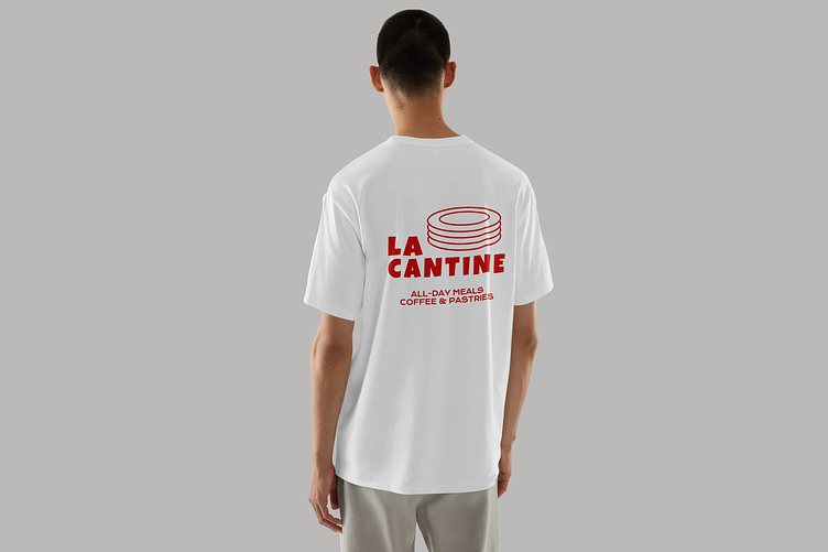
Logo Application
The logo can be applied to printed products, to demonstrate its versatility and impact. This application shows how the logo retains its visual strength and cohesion, contributing to a unified brand identity.
Thank you for your attention. For a complete look at the LA CANTINE case, please check out my upcoming projects!
