ArXiv Webportal Redesign
As part of my academic research in Human-Computer Interaction (HCI), I frequently used arXiv, an essential platform for accessing technical research papers. While the platform serves its purpose, my experience revealed several usability barriers, particularly in navigating, filtering, and comparing research papers. These challenges often resulted in inefficient workflows, especially for users engaged in extensive literature reviews.
Upon analysing the platform, I observed a lack of visual and functional hierarchy that hinders efficient paper discovery. The current design relies on subtle and inconsistent visual cues—such as comments, journal references, and tags—that do not clearly distinguish papers. Additionally, there are no immediately visible anchor points like research paper IDs that users can reference or organise their exploration around. Furthermore, the process of opening papers in new tabs or pages creates friction, complicating the research experience.
Proposed UX Enhancements
Domain-Specific Layout and Improved Information Architecture
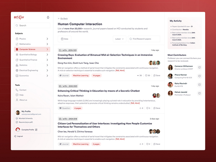
By reorganising the homepage into clear, subject-specific sections, users can more intuitively find papers relevant to their field of interest. Enhancing the information architecture would improve way finding and allow for a more streamlined navigation experience, reducing the time spent on searching.
Prominent Research Paper IDs as Actionable Anchors
Making paper IDs a primary element in each card layout provides a consistent, actionable reference point for users. This approach establishes better cross-referencing between papers and makes it easier for users to organise and track their reading lists, fostering a more structured research process.
Contextual Summaries and Descriptive Metadata
Displaying short, well-structured summaries or abstracts on each paper card, coupled with essential metadata such as publication date, journal impact factor, number of citations, and related topics, delivers at-a-glance context. This reduces cognitive load by enabling users to filter through content quickly and make informed decisions without diving deep into each paper.
Advanced Filtering and Sorting Mechanisms
Introducing robust filtering tools, such as the ability to sort by publication date, citation count, and relevance (trending or niche topics), provides users with a highly customisable and dynamic search experience. The filters could be further enhanced by integrating machine learning to suggest relevant papers based on the user’s past behaviour or research domain.
Modal-Based In-Page Previews
Instead of forcing users to navigate to separate pages to view the full details of a research paper, implementing in-page modals or overlays would offer a more fluid experience. These modals could display key details such as the abstract, references, keywords, and paper structure in a compact format. This minimises the disruption of the user’s browsing flow and enhances decision-making by providing immediate, digestible content without the need for additional clicks or page reloads.
Interaction Design and Usability Impact:
These design enhancements align with core usability principles such as efficiency of use, consistency and standards, and recognition rather than recall. By minimising page transitions and providing immediate, relevant information, these improvements significantly reduce the time and effort required to navigate the platform. Users would benefit from a more intuitive and streamlined workflow, enabling them to focus on critical analysis rather than the mechanics of the interface.
Through these proposed UX modifications—improved information architecture, visible paper IDs, actionable summaries, advanced filters, and modal previews—the arXiv platform can better serve its diverse user base. These changes would enhance the overall usability, ensuring that both novice and expert researchers can more easily explore, evaluate, and engage with relevant research. This would ultimately improve research efficiency and user satisfaction, aligning with the needs of a fast-paced, research-intensive audience.
Thanks for reading!! Cheers


