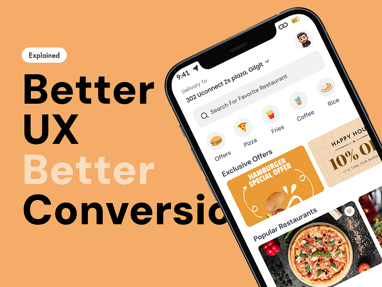
Boosting Conversions in Food Delivery App
💫Background: As a UI/UX design team and users of mobile food delivery applications, including major players like FoodPanda, Kababjees, Savour Food, and more, we noticed particular pain points while using “Easy.Pick", a delivery service in Pakistan. Based on our experience in visual design and usability, we applied user-centered design principles to refine its interface and create a high-converting home, menu & item selection page.
🔸The Problem: In the industry of web design and mobile app design, user interface design plays a significant role in shaping the user experience. The initial interaction with "Pick. a" was not as efficient as expected, largely due to its non-responsive design and color scheme dominated by blue - a color known to suppress appetite! The user experience was affected by poor information architecture, reducing the overall persuasive user experience.


