'The Slug Gallery' UX Design Project

'The Slug Gallery' App/Website
Part of the UX Design certification I have been taking is a project of your choosing - this project is what I have been working on throughout the course.
I chose to design a dedicated app and responsive website for an art gallery. The objective was to create an app that is functional and visually appealing, and to utilise Design Thinking Principles throughout the design process.
Project Duration April - July 2024
My Role Lead UX Designer
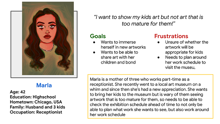
The Problem The museum runs a variety of extensive art exhibitions from well-known artists but have noticed low turn-out, when people were asked why they missed it the majority answered that they did not know the exhibition was happening
The Goal Create an app that users can use to see what exhibitions are taking place at the museum, and book tickets..
Research Phase
Pain Points
Lack of comprehensive information - upcoming shows, artists, subject matter
Unable to book tickets online - having to go on the day and hope to get in
No dedicated place for all gallery info - email for info, phone number online, different socials


Ideation
Competitive Audit
I ran a competitive audit on four other art galleries who provide the same products that the art gallery I am working with also provides.
Audit Goal
To identify how our competitors are displaying scheduling information on their websites
Key Competitors
EDEN Gallery - art gallery and online art purchasing (indirect)-
Dulwich Picture Gallery - art experience center and gallery (direct)
Tate Modern - contemporary art gallery (direct)
Cartoon Museum - interactive art experience (indirect)
Type and Quality of Competitors’ Products
EDEN Gallery - high quality art gallery brand with multiple locations, sexy art and spaces
Dulwich Picture Gallery - fun and youthful art with various events and activities for families
Tate Modern - high class contemporary art gallery, diverse types of art
Cartoon Museum - fun, interactive, playful art experience for kids
How do competitors position themselves in the market?
EDEN Gallery - art collectors, those wanting a high class art experience
Dulwich Picture Gallery - young people and families wanting an interactive fun, and bonding experience
Tate Modern - all ages, art enthusiasts, those interested in niche art
Cartoon Museum - kids, young adults who enjoy comic books, families and groups wanting an interactive experience
How do competitors talk about themselves?
EDEN Gallery - an art ‘experience’ and brand that spans across the world and
Dulwich Picture Gallery - a place for everyone to see and create art, and preserve art
Tate Modern - a variety of diverse pieces of art and exhibitions, comprehensive experience
Cartoon Museum - an outgoing and interactive experience where you have fun and learn together
Strengths
EDEN Gallery - good, clear navigation
Dulwich Picture Gallery - book tickets feature, provides variation in activities, timing schedules, description of events, branding and tone
Tate Modern - clean branding, classy, lets the art do the talking
Cartoon Museum - bright and eye-catching homepage, makes you want to visit
Weaknesses
EDEN Gallery - emphasis on purchasing art, unclear schedule
Dulwich Picture Gallery - overall website experience, bright and vibrant but slow image loading and unclear mobile navigation, unclear user journey
Tate Modern - navigating to homepage from other pages
Cartoon Museum - text alignment on mobile, could be more on-theme and dynamic
Gaps and Opportunities
exhibition specifics (locations in the building)
categorised events / upcoming
‘how to get there’ feature
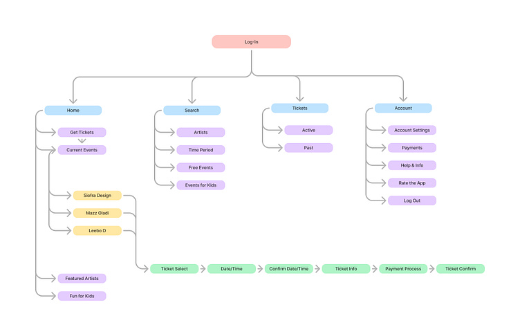
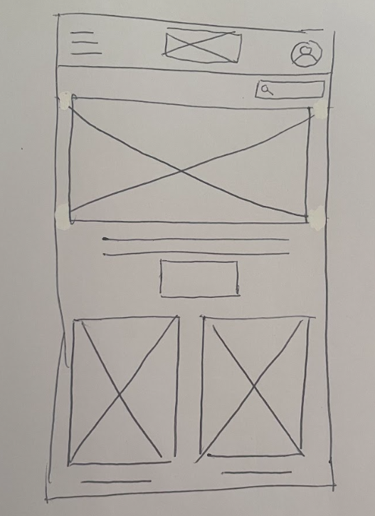
Lo Fi Wireframes
I started by roughly drawing out sketches on paper, then moved into Figma to further develop my ideas.


Usability Study 1
Project background: We want to create a responsive and easy to use website for a local art gallery. The aim is to make it as easy as possible to navigate the website to see what exhibitions and events will be on and when, and then buy tickets online to those events.
Research goals: Make it as easy and straightforward as possible to find information on a specific event and book tickets online
Moderated usability study
Location : Online, remote - Zoom call
Date : June 17th and 18th
Six participants will complete the task in their own home, while on a zoom call with me, navigating the art gallery website to find information on an upcoming exhibition, and go through online booking process
Sessions will be 30-40 minutes long and recorded remotely - Participants fill out a survey afterwards describing how the process was for them
Main Insights
Are we making an app or a website?
No Payment Details screen
Lack of colours/text makes flow confusing
Refining the Design
Building on the insights I got from my usability study I started to work on my hi fi wireframes to incorporate colour and images - bringing the design to life.
I first started with adding basic colour and font specifications that aligned with the art gallery I was designing for.

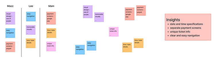
Usability Study 2
Main Insights
No date and time interaction
Needs separate payment screens
Unspecific ticket information
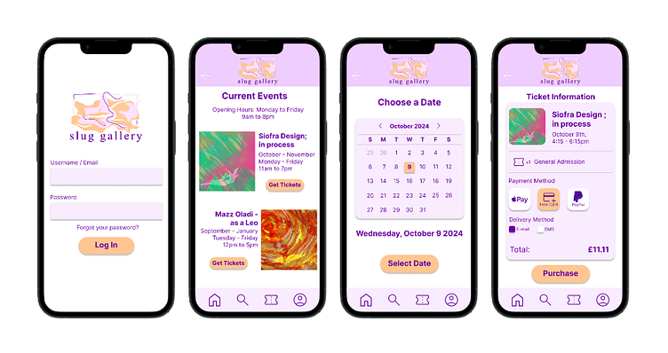
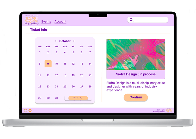
Final Design
After completing my second usability study I was able to take the insights I gathered by participants and use it to inform my final design for this app.
My three main points to build upon were specific interactions within the app; such as selecting multiple tickets, choosing a date and time for your ticket, and selecting a specific payment method.
I also incorporated a bar code icon into the tickets, to ensure it is unique to you only.
Link to prototypes: siofradesign.com/portfolio/art-gallery-app
Sticker Sheet for Project


Accessibility Considerations
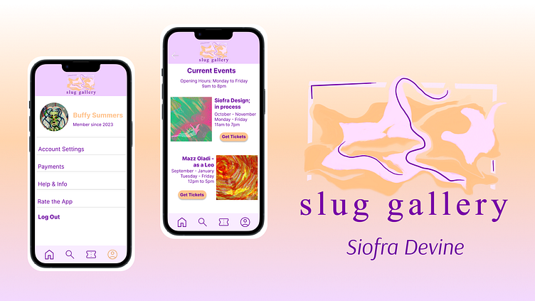
Clear and Consistent Navigation
I wanted the user journey to be as clear and concise as possible when using this app.
I did this by making sure that there is an easily seen 'back' button on each screen and fixing the 'home', 'search', 'tickets, and 'profile' icons to the bottom of every page.
Use of Colour and Colour Contrast
I worked on the colour scheme I wanted to use for this app by thinking in two ways; how the chosen colours translate to those with low contrast sensitivity, and how the colour scheme would make the user feel.
I followed the WCAG guidelines when implementing colour within my designs
Consistent Components
Each button in the ticket purchase flow is a consistent colour and size, guiding the user through the process with ease and comfort.
Fixing integral icons to the bottom of the screen in every page gives a feeling of consistency while using the app.
Next Steps
This project is the first full UX Design project i have undertaken, through my UX Design certification with Google.
In working on this project I followed Design Thinking Principles, and used my own creative experience to create a functional app for use by an art gallery.
I’m especially proud of this project as I feel that this is a perfect blend of my creative mindset in combination with the design thinking skills I have acquired through my education within Design.
I am open to creative and design work opportunities and am eager to showcase my skills in my next project!
Want to work together? Send me an email at siofradesign@gmail.com.
