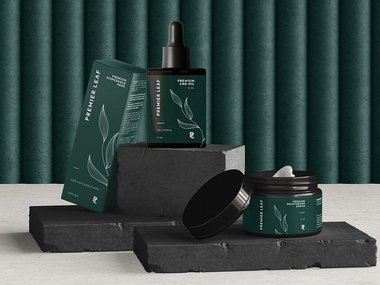
Premier Leaf - Cannabis Brand & Packaging Design
Project Goal
Premier Leaf came to me with a clear vision: they wanted their brand to feel premium, modern, and minimal, with a consistent style that would reflect the quality of their products. The challenge was to create something that would stand out in the growing cannabis market while staying true to their high-end, professional image. They needed a design that would look just as impressive on a small social media icon as it would on packaging in-store. Everything had to feel cohesive, clean, and upscale, appealing to consumers who appreciate luxury and attention to detail.
Solution
To bring this vision to life, I crafted a simple, elegant logotype for Premier Leaf and paired it with a custom PL initial logomark. This mark was designed to be versatile, working beautifully in smaller formats like digital profiles, while still maintaining the brand’s identity. It’s clean, modern, and instantly recognizable.
For the packaging, we focused on a sleek, minimalist layout using a refined green and white color palette. The green connects to the natural essence of the cannabis plant, while the white brings in a sense of cleanliness and sophistication. This combination helped create a look that feels both approachable and high-end. The end result is a brand that not only looks polished and consistent across all platforms but also radiates a sense of luxury—giving Premier Leaf an edge in the competitive cannabis space..
Ready to elevate your brand to the next level? Let’s create something unforgettable! Contact: emir.kudic01@gmail.com


