Sleek & Smooth Shoe Shopping Experience - UI/UX Design
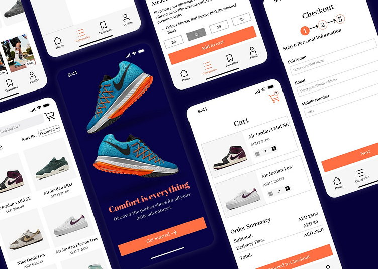
Step into style and comfort! Here’s a mobile app design concept for a shoe store offering a seamless shopping experience. From browsing to checkout, each interaction is crafted with care.
1. Get Started Screen - Engaging Intro "Before diving into the product range, users are greeted with an eye-catching landing page, highlighting the brand's ethos: comfort is everything! Perfect for encouraging users to explore. "
2. Home Screen - Explore & Browse "The home screen welcomes users with a clean and intuitive layout, offering easy navigation to find the perfect pair of shoes. Product categories and personalized recommendations are just a swipe away! "
3. Category Screen - Tailored Shopping "Browse through different categories with precision. Whether you're looking for women’s, men’s, or kids’ shoes, this screen offers a smooth and intuitive navigation experience for every shopper. "
4. Product Detail Screen - The Perfect Fit "Every detail counts when shopping for shoes. This product page offers a clear selection of sizes and an appealing description to help users make informed decisions. "
5. Cart Overview - Easy Management "Your cart is just as easy to manage. Add, edit, or remove items with a simple tap. The clean interface makes sure users can review their items without any hassle."
6. Checkout Process - Smooth Sailing "Checkout is quick and efficient. With a simple three-step process, users can securely fill in their personal details and proceed to payment in no time. "
7. Order Confirmation - Success! "Order confirmed! 🎉 Your perfect pair of shoes is on the way. With a clear confirmation screen, you’ll know when to expect your delivery. Time to enjoy your shopping experience. "
"Let me know what you think! Feedback and appreciation are always welcome.


