UI for Judicial Vacancies
Behind the Scenes: My Journey with Building UI for Judicial Vacancy.
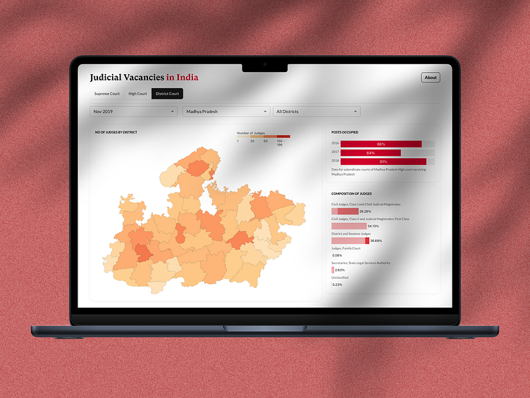
The "Judicial Vacancies" screen is an interactive dashboard designed to provide users with an overview of judicial vacancies across different courts in India, In this example, We are specifically focusing on the district courts in Madhya Pradesh. The interface is built to display data in a visually engaging way, making it easy for users to comprehend trends and details about judicial vacancies, posts occupied over time, and the composition of judges across districts.
Design Goals and Client Collaboration
The client provided us with raw data sets and specific pointers that formed the foundation for this design. The goals were to:
Create an Informative Yet Simple UI: Present complex datasets in a visually simple yet informative manner.
Adhere to Brand Guidelines: Follow the brand’s visual identity, including color schemes, typography, and layout standards.
Ensure Functionality and Usability: Develop a dashboard that is both functional and user-friendly, allowing users to filter data and draw meaningful insights effortlessly.
Be Easy on the Eyes: Since the target audience includes both legal professionals and general users, the UI had to be aesthetically pleasing and easy to navigate.
Given these requirements, our design process was shaped by a deep understanding of the provided data, client feedback, and user needs.
Behind-the-Scenes Design Process
Data Analysis and Understanding Client Needs:
The first step involved an in-depth study of the datasets provided by the client. These datasets contained information on judicial vacancies, the composition of judges, and trends in post-occupancy over the years. We conducted data analysis sessions with data scientists and domain experts to extract key insights and identify what needed to be highlighted in the UI.
Key Findings from Data Analysis:
High variability in the number of judges across districts.
Clear trends in post occupancy rates over the years.
Diverse classifications of judges that needed to be visually represented for better understanding. Armed with this knowledge, we created a set of data visualization requirements that would effectively communicate these insights to the user.
Brainstorming and Ideation:
With the client's pointers and brand guidelines in mind, we held several brainstorming sessions to ideate on possible layouts and visualizations. We explored various data visualization techniques such as heatmaps, bar charts, and line graphs to find the most effective way to represent the data.
Considerations During Brainstorming:
Which visualizations would best represent the complexity of the data while remaining intuitive?
How can we make the interface interactive and user-friendly?
Ensuring the color scheme, typography, and overall layout align with the client's brand guidelines.
We also conducted a competitive analysis to see how similar government data platforms handled complex data and ensured our design was not only unique but also more accessible and engaging.
Wireframing with Brand Guidelines:
Once the visual and functional requirements were clear, we moved to the wireframing phase. Here, we focused on creating a clean layout that balances both text and visuals, ensuring ease of navigation and readability. We kept the following in mind:
Interactive Elements: Dropdown filters for date, state, and district to allow users to focus on the data most relevant to them.
Color Scheme and Typography: We closely adhered to the brand's color palette for visual consistency, using a warm gradient to represent the number of judges and a consistent font hierarchy for readability.
Data Visualization Choice: A heatmap for the number of judges across districts, bar charts for post-occupancy trends, and judge composition to visually break down the information into digestible chunks.
High-Fidelity Prototyping and Client Feedback: After finalizing the wireframes, we created a high-fidelity prototype using tools like Figma. The prototype included:
Interactive Heatmap: To show the number of judges across districts with color-coded intensity.
Trend Bar Graphs: Simple yet effective bar charts to depict trends in post-occupancy from 2016 to 2018.
Composition Breakdown: A bar chart to show the composition of judges, providing a snapshot of various judicial roles.
We presented this prototype to the client for feedback. The feedback sessions helped refine certain aspects, such as:
Improving Filter Options: Adding more granular filter options for a more tailored user experience.
Refining the Legends and Tooltips: Making legends clearer and more descriptive to enhance data comprehension.
Adjusting Visual Elements: Ensuring the visual hierarchy and alignment follow the client's brand aesthetics more closely.
User Testing and Iterations:
After incorporating the client's feedback, we conducted user testing with a sample audience, including both legal professionals and laypersons. The goal was to ensure the dashboard was intuitive, visually appealing, and effectively communicated the necessary information.
Insights from User Testing:
Users appreciated the clean layout and the clarity of the data visualizations.
Some users suggested slight adjustments in font size for better readability.
Additional hover-over tooltips were added to explain data points in detail for novice users.
These insights led to further refinements, ensuring the dashboard was not only functional but also met the user's expectations and needs.
Final Development and Handoff:
Once the design was finalized, we created a comprehensive design system that included all visual elements, typography, spacing guidelines, and interaction states. This design system was shared with the development team to ensure a seamless translation from design to code. Close collaboration with developers during the build phase ensured that the final product was fully aligned with the client's vision and the design team's intent. The interactive elements, visual consistency, and overall user experience were carefully tested during this phase.

