Confirmation Modal Dialogs - Delete, Warning, and Success
Summary
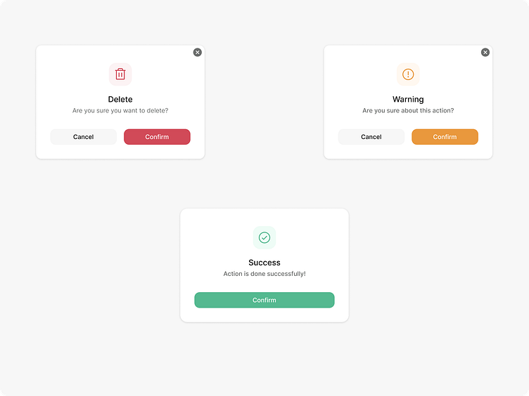
Three confirmation modal dialog boxes used for different user actions:
Delete Modal (Red):
Purpose: Confirms deletion action.
Text: "Are you sure you want to delete?"
Actions: Includes "Cancel" (neutral) and "Confirm" (red to indicate caution).
Warning Modal (Orange):
Purpose: Warns the user about an action.
Text: "Are you sure about this action?"
Actions: Offers "Cancel" (neutral) and "Confirm" (orange to signal caution).
Success Modal (Green):
Purpose: Indicates successful completion of an action.
Text: "Action is done successfully!"
Action: Features a "Confirm" button in green for acknowledgment.
Each modal is simple, with clear, color-coded actions to guide the user through their decision-making process.
Press the L if you like my Design
More by Daniel View profile
Like
