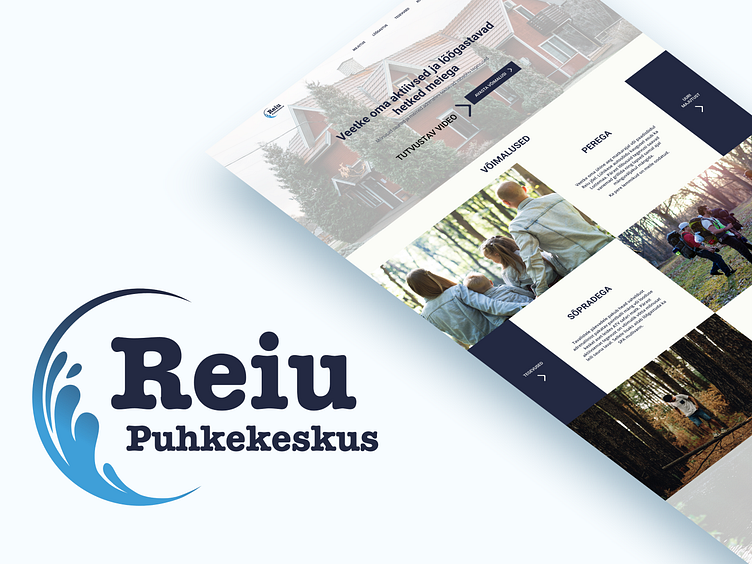
Reiu Puhkekeskus Redesign
Reiu Recreation Center Logo and Homepage Redesign
The client had recently bought a recreation center. While renovating the buildings they also wanted to redesign their visuals, which is why they reached out to me.
The initial meeting revealed they had following issues:
outdated logo
too simplified homepage
To get the customers vision and expectations of their branding we created a brief.
Logo redesign
For logo redesign my process was following:
1. A mindmap on what customers told me about their bigger goal for the recreation center, what I saw on the premises, the location, their services, etc.
2. Did a competitor research for how to distinguish them from other recreation centers.
3. Draw a bunch of logo ideas on paper.
4. Selected top 3 which most resonated with their vision and did the graphics in Adobe Illustrator.
5. Presented them to the client and client selected which they most liked.
6. Did the final touches to the logo and documented the use cases.
Web redesign
For the webpage redesign I did the layouts on the paper. When this was done I continued with the Hi-Fi prototype in Figma. When it was ready and I presented it to the client they had a surprise due to they actually had a certain design in their mind. Of course this was not discussed in the initial briefing meeting.
Learning point: during the briefing meeting AND prior the next assignment ask the client if they still give you free hands on the design or maybe they have any ideas what kind of design they might prefer to see.
After this point I took their example page as a reference and designed their new homepage according to it. They were most exited about the new design.
This sparkle in the clients eye is what I always like to see.


