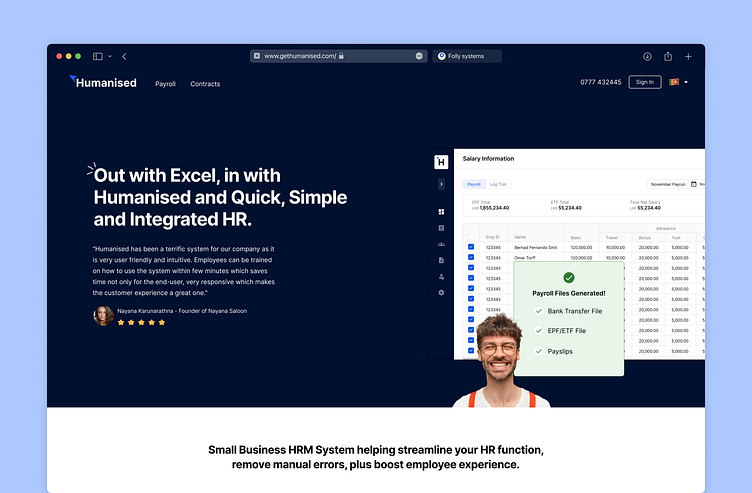
Designing a Humanised SaaS Product Website
This website was designed three years ago for our HR/Payroll System, tailor-made to enhance payroll services for Chartered Accountancy firms and SMEs. These organizations require reliable, error-free, and profitable payroll solutions, and our website effectively showcases the capabilities of our cloud-based payroll platform. With a focus on simplifying payroll tasks, we crafted a user-friendly, engaging experience that highlights how our product can streamline operations for firms.
The design was created with key decision-makers in mind, including CEOs, HR Managers, and Payroll Managers, addressing their unique challenges. Here’s a preview of the user-centered design choices that enhance their journey.
Funnel Design
Our funnels were designed to capture user preferences and gather insights about them, such as the type of organization they manage, the number of employees they have, and other critical data. This personalized approach allows us to better understand their needs and offer tailored solutions.
Navigation Designs
Simplified, well-organized navigation ensures users can easily find what they need, improving their overall experience and encouraging engagement.
I hope you enjoy this look into our process! ❤️ Hit like if you do and feel free to share your thoughts.
Got a project? Let’s chat: lahirump@yahoo.com
Thanks for the support! 🙌


