Daily UI #005 - App Icon
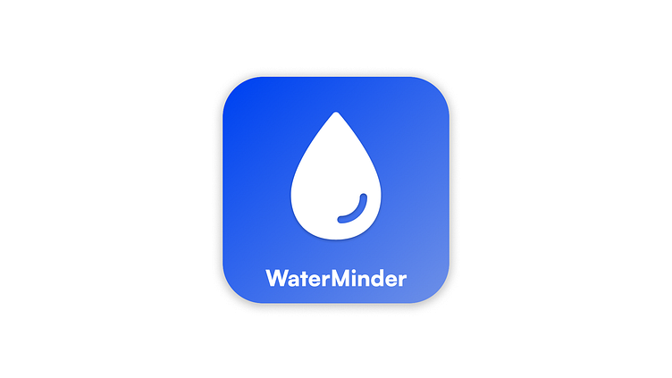
On day 5 of my 100-day UI design challenge, I designed a logo for the WaterMinder app, which helps users stay hydrated by reminding them to drink water regularly. The goal was to create a simple, clean, modern icon visually representing the app's core functionality.
Key Features of the Logo Design:
Minimalist Water Droplet Icon: A single droplet symbolizes hydration and health, with a subtle curve to add a friendly and approachable touch.
Blue Gradient Background: A calming blue gradient was chosen to represent water and wellness while adding a modern feel to the design.
Clean Typography: The app name "WaterMinder" is displayed in a clear, readable font to maintain simplicity and ensure the logo stands out.
I’d love your thoughts and constructive feedback on this design. Any suggestions to improve the logo or make it more effective are welcome. Thank you for taking the time to share your insights!
