Salire Coffee | Brand Identity & Packaging Design
Salire: Organic & Fairtrade Coffee
Project Brief: Salire Coffee is a premium brand that specialises in organic, fairtrade coffee. Their offerings include hand-roasted espresso beans, espresso pods, a shop, and a café. The brand focuses on delivering a luxurious, energising, and sophisticated experience, aimed at coffee enthusiasts who appreciate a refined morning ritual.
Solution: The brand identity draws inspiration from the vibrancy of a sunrise, featuring a warm colour palette of oranges and reds that symbolise energy, vitality, and a fresh start to the day. The typography reflects the delicate artistry of latte patterns, with the letterforms for “a” and “e” capturing the swirling, graceful motion of milk mixing into coffee. This project visually and emotionally represents the sensory pleasure of a morning coffee, creating a refreshing and sophisticated brand experience.
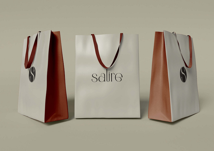
Services: Brand Naming, Identity Design & Packaging
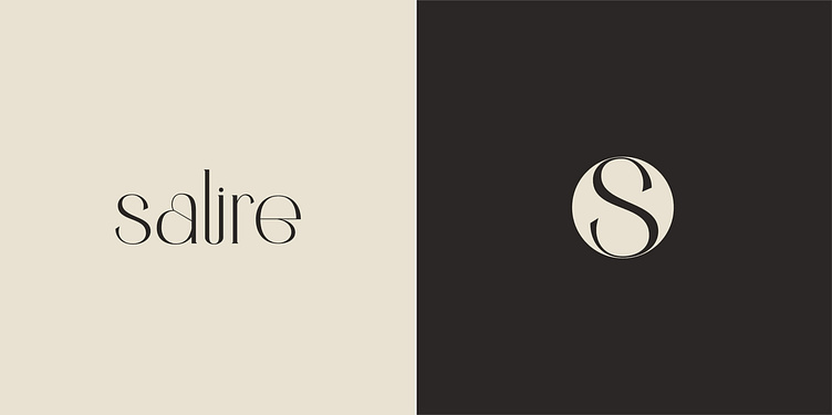
Logo Concept:
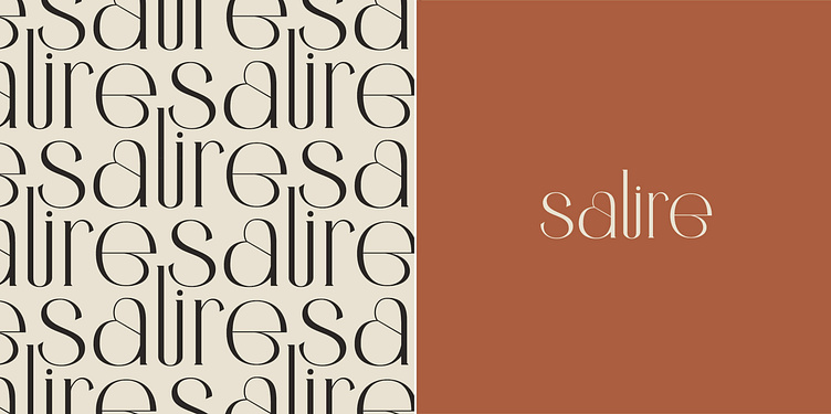
Brand Naming: The name "Salire" comes from the Italian word meaning "rise," perfectly capturing the essence of starting the day with a boost. The tagline "Where Every Sip is a Sunrise" reinforces the brand's promise of daily vitality.
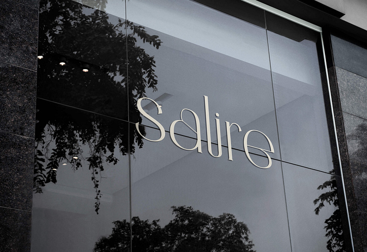
Logo Design: The modern, minimalist typography features flowing letterforms, with "a" and "e" swirling inward, evoking the beauty of latte art and the smooth blend of coffee and milk. This adds a sense of artistry to the branding.
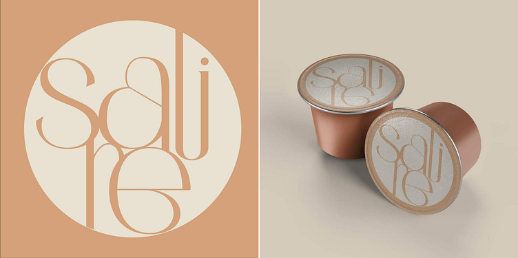
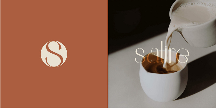
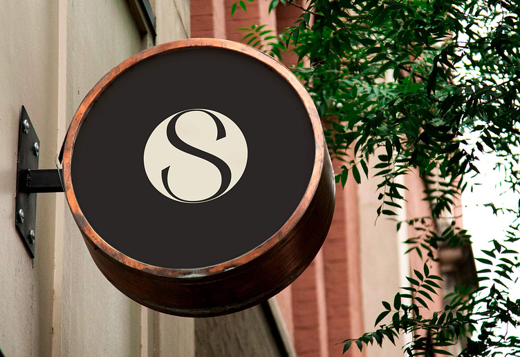
Submark: The circular submark contains the letter “S” from the main logo, designed to resemble looking down into a cup of coffee with a swirl pattern on top. This not only represents the brand’s name but also its connection to the coffee experience....
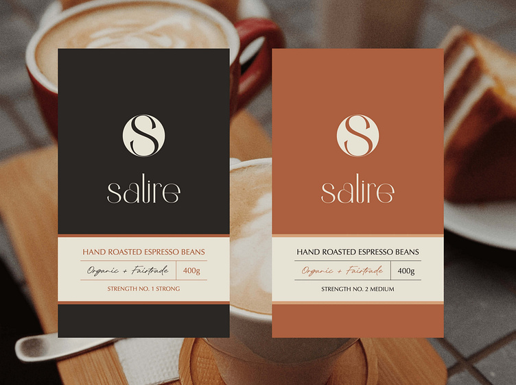
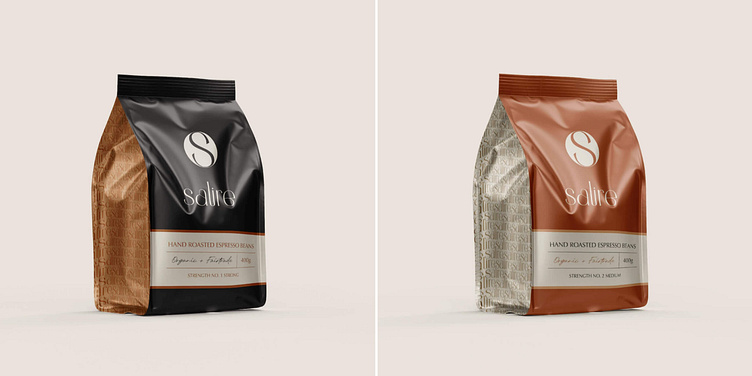
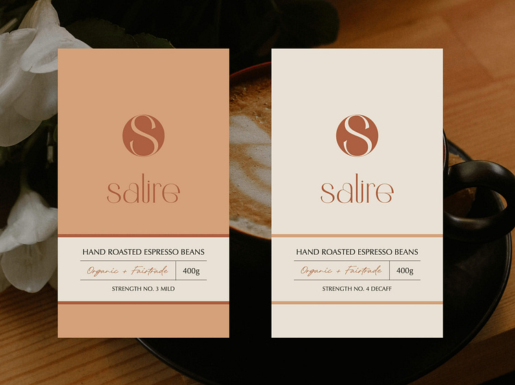
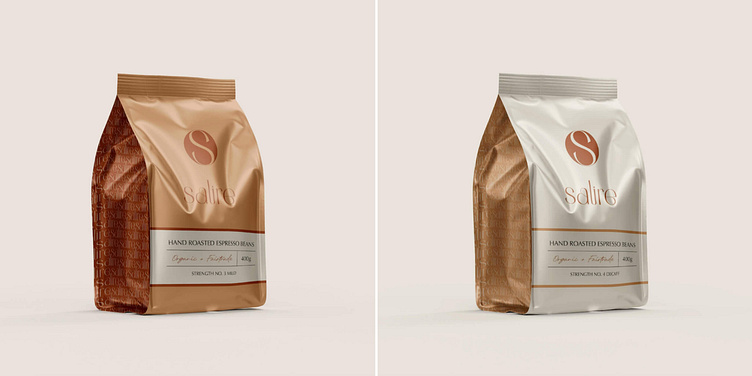
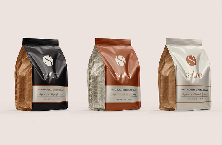
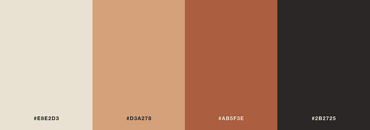
Colour Palette: The colour scheme is inspired by the hues of a sunrise, perfectly aligning with the brand’s morning-centric concept. Each colour also represents a different strength of coffee:
#E8E2DE – Creamy neutral, symbolising milk in coffee.
#D3A278 – A warm, medium orange, representing mild coffee.
#AB5F3E – A deep orange-red, symbolising medium-strength coffee.
#2B2725 – A rich dark shade, ideal for strong coffee.
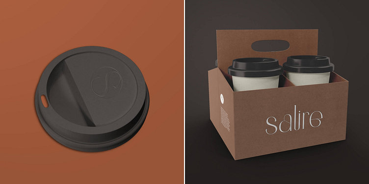
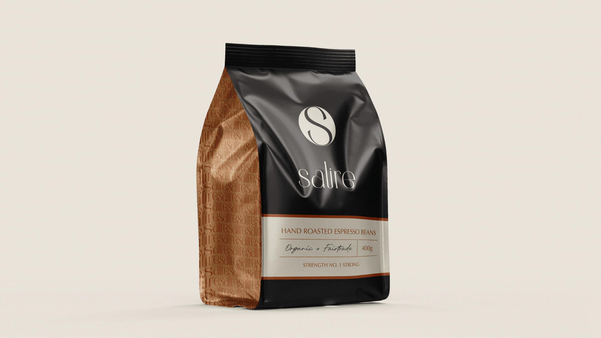
Packaging Design: The packaging design is sleek, stylish, and intended to be an attractive addition to any kitchen counter. Each colour from the palette represents a different coffee strength, ensuring that the packaging is both functional and beautiful.
Key features include highlighting the brand's commitment to sustainability, focusing on its use of fairtrade and organic espresso beans. The design leans into the artisan nature of the coffee rather than mass-produced products, enhancing the brand’s luxury and handcrafted feel.