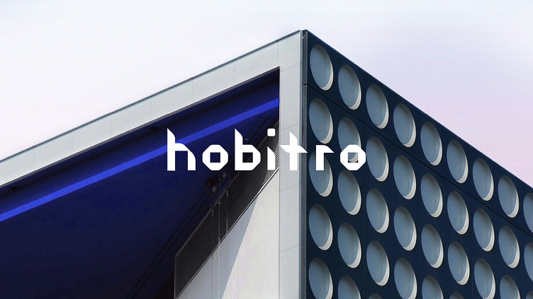
Hobitro Brand Identity Design
Hobitro
Where Architecture Meets Innovation. Based in the USA, we craft spaces that redefine living, working, and shopping. Our canvas spans residential, commercial, and retail domains. Our logo - a minimalist masterpiece - embraces the future of architecture. A bold "H" captures our essence, a symbol of modern trends. Clean lines within a rectangular frame evoke stability. A central rhombus adds a unique touch, effortlessly memorable in its simplicity. Typography dances in harmony with our logo. A design that stands alone or intertwines seamlessly.
The letters "H," and "A" redefine identity, a fusion of form echoing our brand mark. In serene blues, our corporate colors breathe calmness and logic. A palette best showcased against a pristine white canvas, allowing ideas to take center stage. Meet Acumin Pro, our chosen font. Versatile, practical, a true companion across media. From graphic design to websites, from signage to editorial layouts, Acumin Pro's richness shines through. Hobitro - Redefining Spaces, Fusing Minimalism. Your architectural journey, elevated.
—


