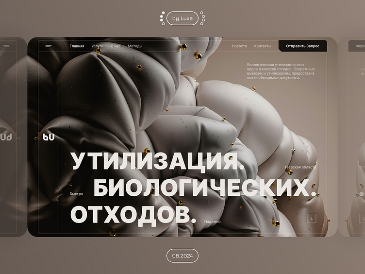
Concept "Gold" || Waste Utilization
Hi, guys 👀
Prepared a new 3 concept initial screen from the Health Care theme.
This time I decided to move the emphasis from the button to the header, and highlight the button itself to catch the eye.
Colors and Font
I used background colors to make the design look organic. And as usual, I used the Inter font.
Luxe
Show your cynic ❤️ and share your thoughts in the comments on the concept!
Let's collaborate and create something extraordinary!
📞 WhatsApp - +79953916119
🌐 Instagram - luxe_ux_ui
📩 Email - veeeelp5@gmail.com
More by Aleksandr Kirikov View profile
Like


