Design #1: Achievements at a Glance
Welcome to The Design Book, where I've showcase carefully crafted website design sections every day. Each post is a glimpse into how we approach clean, functional, and visually appealing UI designs.
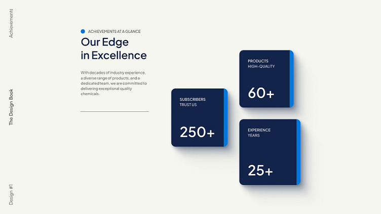
Today, I'm spotlighting the Achievements Section, designed to emphasize accomplishments with clarity and impact.
Bold & Clear Metrics: Displays 25+ years of experience, 60+ products, and 250+ trusted subscribers in an engaging, easy-to-read format.
Clean Layout: A structured design that prioritizes readability, drawing attention to key accomplishments.
Shadows for Depth: Adds dimension to the numbers without overwhelming the user’s focus.
Balanced Typography: A mix of bold headings and clean body text for effortless scanning.
Professional Color Palette: Blue tones that convey trust, reliability, and professionalism.
Stay connected!
