Plasma Music Player - Concept for Plasma 5
Unlike my past uploads this one is fresh. For a couple of years I wanted to make a music player as I found the ones currently available for KDE and Qt not up to par. They're music players alright but in my opinion the way their interface is laid out is far from optimal for managing a library of music and the few ones that do have an interface for such a task look more complicated than they really are.
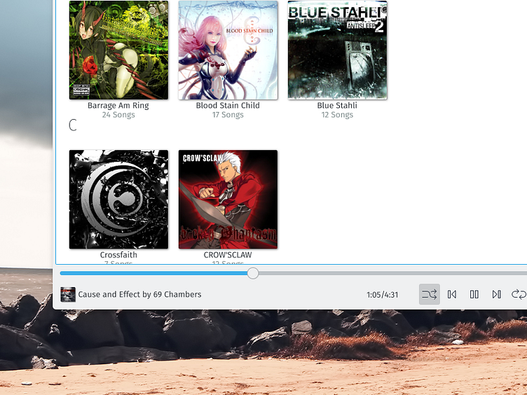
First of all the way the library is presented in these players as a long, very long list of songs is not appealing, not for me. So first thing is to have the album art displayed by default in all categories.
This is certainly a better way to showcase a library already.
Second, in most cases these players have a tendency to put the player controls on the top. Inspired by you-might-guess-who. So I moved it to the bottom, where it makes more sense. Leaving the top area for a toolbar, like other software in the system does.
Third, these music players do this "thing" where they either have tabs in uncommon places or big, big buttons. To conform to the look of other Plasma applications I used normal sized toolbuttons with text labels as is the default appearance in Plasma. I prefer just the icons though, saves space too. Also I should note that I used icons found in the system (you can change the icon theme in every *nix desktop env. available) instead of embedding graphics in the player's interface (like it's usually done, sadly). These icons are part of my Nitrux theme which I'm using right now.
Fourth, all players have a "currently playing" view at either side. Usually at the right, that's fine however the way it's presented is not ideal. I used the native Plasma listview with tabs and added a "Save List" button and a "Clear All" button. Some players do have a save list button, some don't, but generally the clear action is done through a menu (right-click).
Adding to that there's a "Sync Device" tab. Most players have a similar option, I decided to keep it but I placed it in a more discoverable location.
Player controls are front and center, as they should. I only found one other music player that did this. To the left is the timer and next to it a ticker that displays the song information. Above is the media seeker and to the far right the volume slider.
Above the current playlist area the player displays the album art, artist, album name, year and rating. Centered too as it resembles the way Dolphin (Plasma's file manager) displays previews which is the closest to what I wanted to add there. I found most players did have this in common, and it's nice but I believe this is far more consistent with the rest fo the interface.
Finally, a visible search bar, a dropdown with options I'll explain below, two buttons to change between display modes and the main functions of the player. -- I completed this concept in 3 days (Sunday-Wednesday). Other than the background and the album covers everything else is vectors done in Inkscape on Linux.
Full-size image: https://ndisk.io//s.php?f=uriherreraBRctNSo0Uz How does it work: https://ndisk.io//s.php?f=uriherreraF4inXh4MDU (download to read)
