BrandLife
Colours
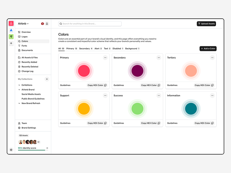
It’s pretty much a very cool grey scale colour scheme. It’s maximised for accessibility and designed in a way that ensures that colours don’t clash with the assets uploaded in the platform.
Full Case Study on Behance 🤘
It’s pretty much a very cool grey scale colour scheme. It’s maximised for accessibility and designed in a way that ensures that colours don’t clash with the assets uploaded in the platform.
Full Case Study on Behance 🤘