Qhub — Side Screens
QHub provides users possibility to stake Promo NFTs and earn fungible reward points. NFT staking locks up liquidity, enhances user engagement, binding users to your project.
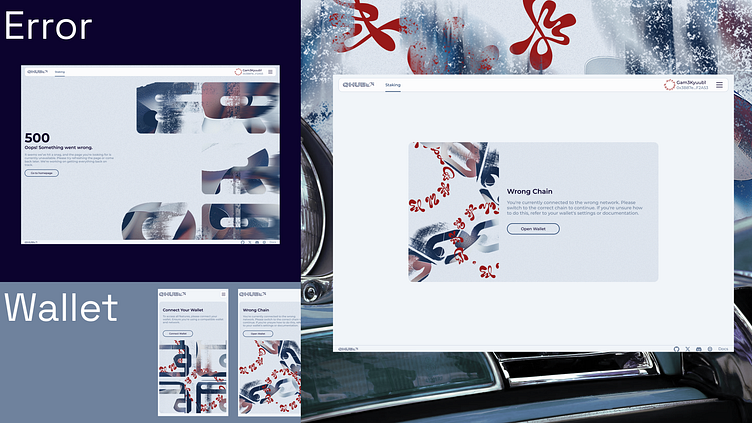
Error Pages & Beyond In the digital realm, user experience extends beyond success flows. Our additional screens, including error pages and wallet connections, ensure seamless interactions even when things go off-course. The 404 Page, layered with bold visuals and dynamic messaging, redirects users with clarity and a hint of attitude.
For wallet connections, we’ve crafted a flow that feels secure and intuitive, with visual cues that match the raw aesthetic of the platform. The wrong chain screen emphasizes user education, with sharp visual feedback to guide them back to the correct network, creating a momentary disruption that still feels aligned with the brutalist design.
Each screen embodies the overall design philosophy—stark, direct, and functional, with strong contrasts and urban textures, ensuring that even moments of friction maintain a cohesive user experience. Whether it's an error, a failed connection, or the need for redirection, these screens play a pivotal role in bridging user trust and engagement.
Georgi (Knjažev) Knyazhev — Design Lead, Web & UI/UX Design | Yana Sutori — Advising | Stas Chernenko — CPO
